Build Real-Time Media Apps With MediaSFU
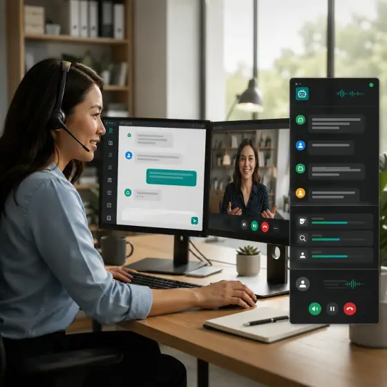
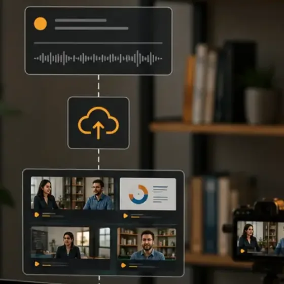
MediaSFU is a real-time communication platform and SDK family for WebRTC video calling, voice calling, conferencing, webinars, live streaming, chat, recording, screen sharing, whiteboard, polls, live subtitles, translation, AI voice agents, and SIP/PSTN workflows.
MediaSFU provides framework-specific SDKs and shared core primitives so teams can start with prebuilt room UI, then progressively customize or replace that UI without replacing the media runtime.
Start here if you are integrating MediaSFU into a product and want the fastest path from install to a secure working room.
New here? Choose your SDK first, then choose how much of the default MediaSFU UI you want to keep.
If you do not want to get lost
- Choose your SDK.
- Choose your backend mode.
- Choose your room shape.
- Choose how much of the default UI you want to keep.
That sequence is the cleanest way to avoid mixing infrastructure, integration, and customization problems together.
Why teams start with MediaSFU
- Prebuilt room components for faster shipping
- Progressive customization with
uiOverridesand custom cards - Headless mode when your product needs a fully app-owned experience
- One product model across React, Angular, React Native, Expo, Vue, Flutter, Kotlin, and shared-core integrations
- MediaSFU Cloud for managed infrastructure or MediaSFU Open for self-hosting
5-minute quickstart shape
import { MediasfuGeneric } from "mediasfu-reactjs";
export function App() {
return (
<MediasfuGeneric
credentials={{ apiUserName: "your-user", apiKey: "your-key" }}
connectMediaSFU={true}
/>
);
}
Need a custom UI later? Keep the runtime, switch to returnUI={false}, and reintroduce only the pieces you want.
Start here
Secure the backend boundary
Start with a production-safe create and join flow before branding or shell replacement work.
Choose an SDK
Compare React, Angular, React Native, Expo, Vue, Flutter, Kotlin, and the shared-core package.
Choose your UI mode
Decide whether to keep MediaSFU visible with returnUI={true} or drive a fully app-owned shell with returnUI={false}.
Read the API surface
Jump into generated package API docs when you need exact types and signatures.
Preview components visually
Use the ReactJS Storybook companion to inspect overrideable cards, controls, and guide stories before editing your app.
See Angular room screenshots
Compare live in-room Angular conference, webinar, broadcast, and chat captures before picking a room component.
Browse implementation recipes
Use curated patterns and upcoming starter builds for things like backend-safe quickstarts, branded call screens, and host dashboards.
Recommended reading order
- Quickstart
- Beginner Paths
- Secure Backend Proxy
- Choose Your UI Mode
- SDK Guides
- Starter Screens
- Build Style Guide
New to MediaSFU?
Ordinary developer path
Start with the beginner sequence for SDK choice, secure backend setup, UI customization level, and starter project selection.
Choose your SDK
React Native
Best for bare React Native mobile apps with direct native workflow control.
Kotlin
Best for Android and Kotlin Multiplatform apps using Maven Central artifacts.
Shared Core
Best for custom wrappers, advanced integrations, and framework extension work.
Choose your backend mode
| Mode | Best for | Read next |
|---|---|---|
| MediaSFU Cloud | Fast onboarding, managed infrastructure, less ops work | Secure Backend Proxy |
| MediaSFU Open / self-hosted | Private infrastructure, local control, custom deployment requirements | Secure Backend Proxy |
Choose your room shape
| Room shape | Best for | Example reference |
|---|---|---|
| General meeting | Team calls, product defaults, and general-purpose rooms | SDK Guides |
| Conference | Workshops, panels, classes, and multi-speaker collaboration | Angular SDK Gallery |
| Webinar | Host-led presentations, audience participation, and stage-centric events | Angular SDK Gallery |
| Broadcast | Livestream-style creator flows, host dashboards, and invite/share-heavy sessions | Angular SDK Gallery |
| Chat-first | Support, low-bandwidth collaboration, and messaging-led workflows | Angular SDK Gallery |
Choose by build style
Headless Mode
Keep MediaSFU logic and workflows while replacing the UI shell completely.
UI Overrides
Keep the default experience and replace targeted screens or components.
Custom Components
Replace larger UI blocks with your own components and interaction model.
What this portal covers
- framework-specific SDK setup and package guidance
- usage paths for quickstart, headless, override, and replacement models
- generated API reference sites for each package
- visual previews for React UI surfaces through Storybook
- production guidance for secure backend boundaries and UI customization choices