MediaSFU Angular
This guide gives you the public setup path for the MediaSFU Angular package and points to generated API references when you need exact signatures or types.
Quick start
- Best for: Angular apps with DI-based wrappers
- Package/artifact:
mediasfu-angular - Install:
npm i mediasfu-angular
Start in 60 seconds
- Install the package:
npm i mediasfu-angular - Pick backend mode: MediaSFU Cloud or self-hosted MediaSFU Open.
- Follow the first setup section below for your framework.
Before you continue
- Best for: Angular apps with DI-based wrappers
- New to MediaSFU? Start at /sdks to compare frameworks quickly.
Copy/paste starter
Start with install + backend config, then follow the first integration section below.
npm i mediasfu-angular
export const mediaSFUConfig = {
  // Cloud mode
  credentials: {
    apiUserName: process.env.MEDIASFU_API_USERNAME ?? '',
    apiKey: process.env.MEDIASFU_API_KEY ?? '',
  },
  localLink: '',
  connectMediaSFU: true,
};
export const mediaSFULocalConfig = {
  // Self-hosted mode
  credentials: undefined,
  localLink: 'http://localhost:3000',
  connectMediaSFU: true,
};
Do not skip this order
- Decide backend mode first: MediaSFU Cloud or self-hosted MediaSFU Open.
- Validate one successful create or join flow with the default room surface from this SDK.
- Only then customize the shell, cards, or room ownership model.
- Use the generated API reference when you need exact symbols or signatures, not as the first stop.
This order prevents most early confusion and keeps backend issues separate from UI customization work.
Choose your backend mode
| Mode | Best for | What you must provide |
|---|---|---|
| MediaSFU Cloud | Fastest onboarding, managed infrastructure, less operational work | Cloud credentials stored in secure runtime or build configuration. |
| MediaSFU Open / self-hosted | Private infrastructure, local control, custom deployment requirements | A self-hosted MediaSFU Open deployment plus the URL or config you pass into localLink or the equivalent connection setting. |
If you have not made this choice yet, make it before going deeper into customization or API reference material.
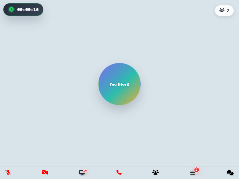
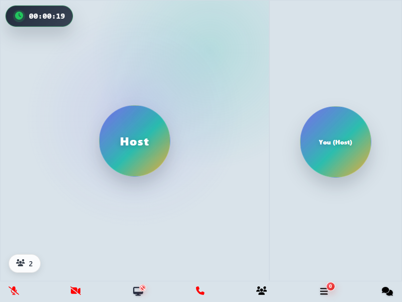
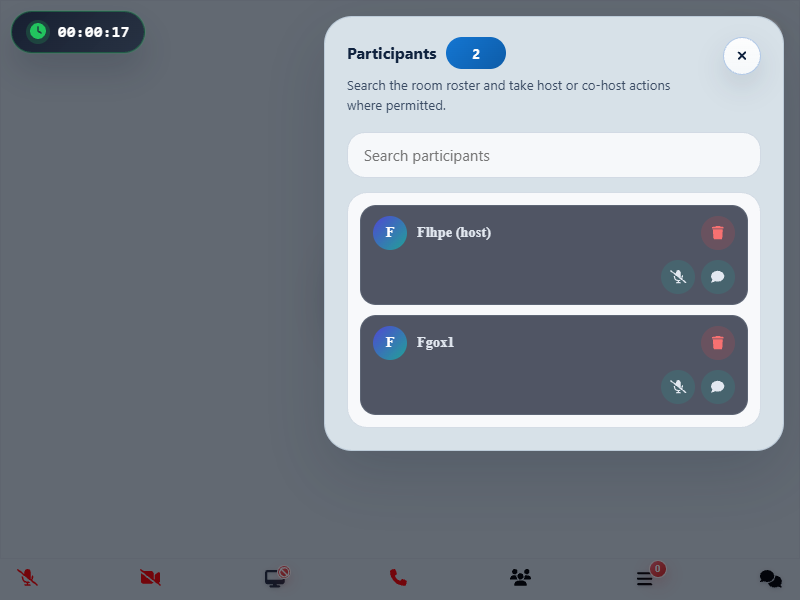
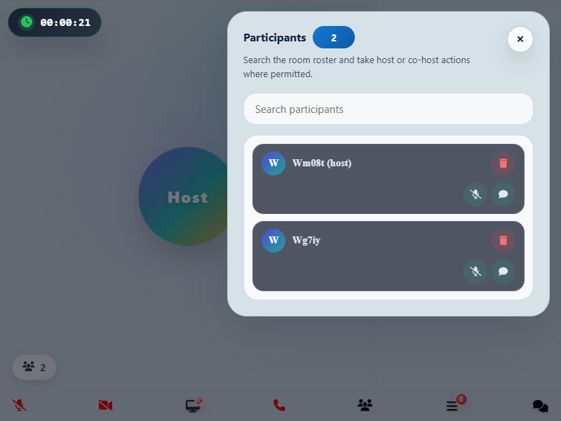
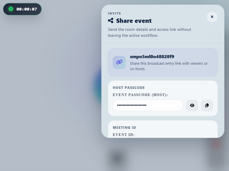
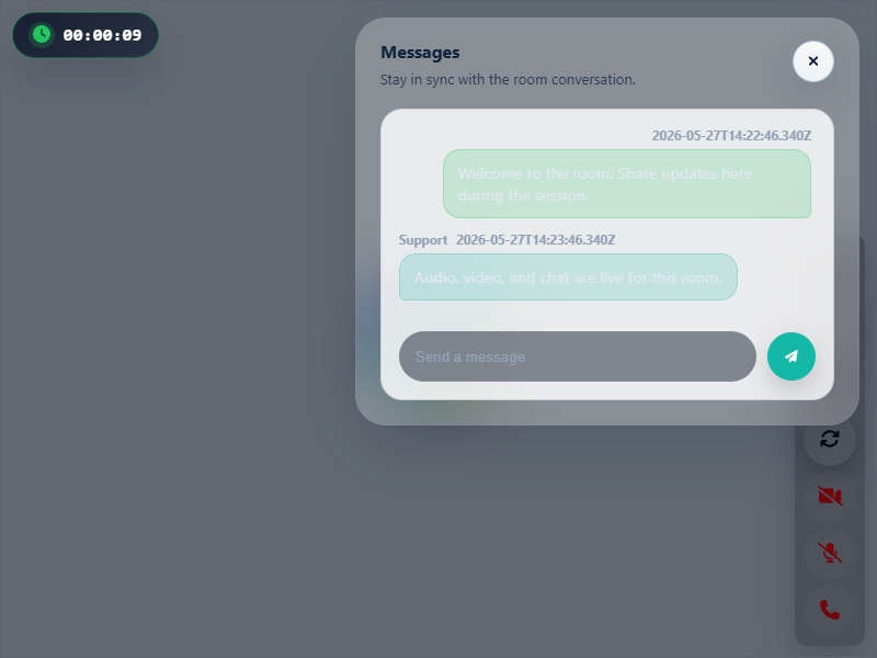
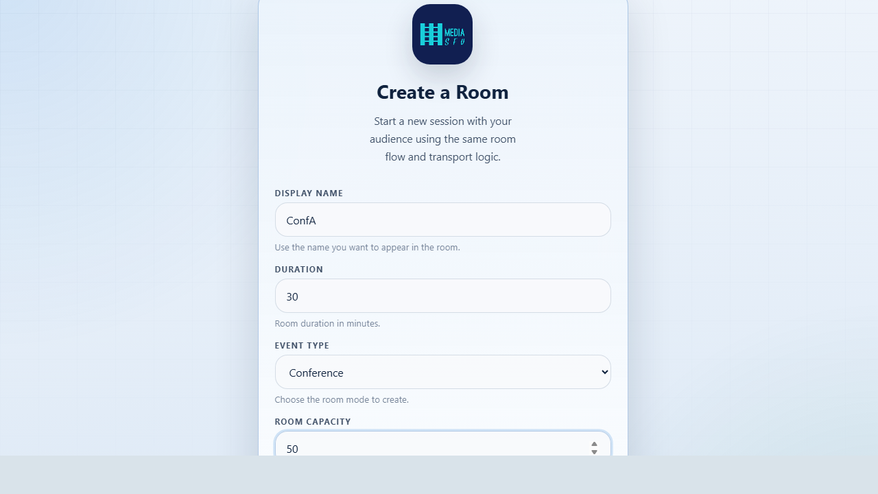
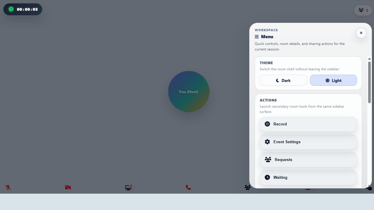
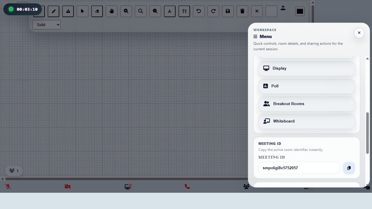
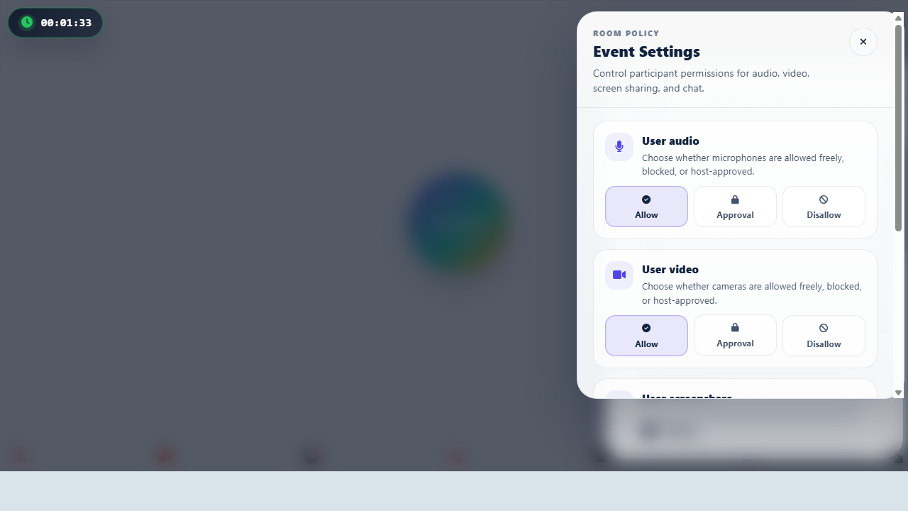
Angular UI gallery
These are live Angular SDK captures generated from the local validation host after a real room create flow succeeds and the main meeting interface is mounted. Use them to compare the Angular conference, webinar, broadcast, and chat experiences before deciding which room component to wire into your app.
The featured screenshots below are in-room captures, not static mocks. Modal shots are taken with the live room shell already active in the background. Conference and webinar now include a second real participant join so the gallery reflects a fuller meeting state. Separate prejoin capture files still exist for onboarding or entry-flow references, but they are not the main product gallery.
| Conference room | Webinar room | Broadcast room | Chat room |
|---|---|---|---|
 |  |  |  |
| Conference participants modal | Webinar participants modal | Broadcast share modal | Chat messages modal |
|---|---|---|---|
 |  |  |  |
The additional workflow captures below come from directly navigating the live Angular UI through entry, workspace, and configuration pages rather than stopping at the mounted room shell.
| Create flow | Workspace menu | Whiteboard workspace | Event settings |
|---|---|---|---|
 |  |  |  |
Need fresh captures after UI work? Run npm run capture:angular-sdk-screenshots from the website folder while the Angular validation host is running.
API reference
- Start with the portal overview at /api-reference.
- Use the MediaSFU Angular entry on that page to open the staged TypeDoc site for this package at
/api/angular/.
Use the SDK guide for workflow guidance and the staged TypeDoc site for exact package details, generated symbols, and signatures.
Common setup mistakes
- Using Node-style
process.envdirectly in runtime Angular code without build-time injection. - Using self-hosted mode without setting
localLink. - Starting in full custom mode before validating the prebuilt flow.
- Backend endpoint unreachable (Cloud credentials invalid or self-hosted server offline).
- Credentials committed directly in source files instead of secure environment configuration.
If setup fails, verify install → backend mode → credentials/local link in that order.
Troubleshooting quick checks
| Check | Symptom | Quick fix |
|---|---|---|
| Backend mode mismatch | Join/create flow fails early | Confirm Cloud credentials for cloud mode, or set localLink for self-hosted mode. |
| Runtime env not injected | Credentials appear empty | Move secrets/env to Angular build-time config and verify values at runtime. |
| Dependency mismatch | Build/install warnings | Reinstall dependencies and avoid force-install flags unless absolutely required. |
Use this table first before diving into deeper API sections.
Production readiness checklist
- Backend mode decided (Cloud vs self-hosted) and documented.
- Credentials/keys sourced from secure environment config (not hard-coded).
- Runtime configuration is injected via Angular-safe environment/build config.
- Happy-path join/create flow validated end-to-end.
- Release build passes cleanly in the target app environment.
Mark all items before release.
MediaSFU Angular SDK · mediasfu-angular on npm
mediasfu-angular is the Angular 17/18/19 WebRTC SDK for video conferencing, webinars, live streaming, broadcast, screen sharing, whiteboard, chat, recording, live subtitles, translation, and AI agent rooms — powered by MediaSFU Cloud or your self-hosted MediaSFU Open server. Install with npm install mediasfu-angular.
MediaSFU Angular SDK
Prebuilt Angular SDK for WebRTC video conferencing, webinars, livestreams, chat, screen sharing, recording, breakout rooms, whiteboards, polls, live subtitles, and translation.
MediaSFU Angular is an Angular video conferencing SDK with prebuilt room components for meetings, webinars, livestream-style broadcasts, and chat-first rooms. It gives you production-ready room UI plus the lower-level helpers needed to move from a full prebuilt experience to a deeply customized Angular app without rewriting the media stack.
Quick Start: First Working Room
npm install mediasfu-angular
credentials = {
  apiUserName: 'your-user',
  apiKey: 'your-key',
};
<app-mediasfu-generic
  [credentials]="credentials"
  [connectMediaSFU]="true"
></app-mediasfu-generic>
That is the fastest path to a working Angular video conferencing room. Once the secure create/join path works, layer in branding, overrides, or a fully custom shell.
Pick the Right Angular Room Component
Use this table to match each Angular room component to the product shape you are building.
| Component | Best for | What users get | When to choose it |
|---|---|---|---|
app-mediasfu-generic | General meetings, team calls, product defaults | Balanced room layout with the broadest starter path | Start here if you are unsure which room type fits best. |
app-mediasfu-webinar | Host-led presentations, audience participation, stage-centric events | Webinar-style room flow with participant management and moderation surfaces | Choose this when one or a few presenters lead a larger audience. |
app-mediasfu-broadcast | Livestream-style shows, creator dashboards, host-first production flows | Broadcast-oriented shell with invite/share and host control emphasis | Choose this when the host workflow matters more than equal participant presence. |
app-mediasfu-chat | Text-first support rooms, low-bandwidth collaboration, chat-centric experiences | Message-forward room UI with the same create/join/runtime foundation | Choose this when conversation is the product and audio/video are secondary. |
app-mediasfu-conference | Collaborative multi-speaker events, panels, classes, workshops | Multi-participant conference layout with richer shared-presence expectations | Choose this when many participants are expected to be visibly active. |
Least Confusing Start Path
- Start with
app-mediasfu-genericand validate one successful create/join flow. - Decide backend mode early: MediaSFU Cloud or self-hosted MediaSFU Open.
- Move to
app-mediasfu-webinar,app-mediasfu-broadcast, orapp-mediasfu-chatonly after the base room flow is working. - Use
uiOverrides, custom cards, andcustomMainComponentbefore going fully headless. - Switch to
returnUI="false"only when you already know which MediaSFU runtime helpers your product needs.
Common Angular Product Shapes
Use MediaSFU Angular when you need one of these product patterns:
- Angular video meeting UI with secure create/join flow.
- Angular webinar UI with host, audience, and moderation surfaces.
- Angular broadcast UI for livestream or creator-style host workflows.
- Angular chat room UI with MediaSFU room orchestration behind it.
- Angular collaboration rooms with recording, screen share, whiteboard, polls, captions, and translation in one SDK.
Why teams use MediaSFU Angular
- Start fast with prebuilt room components such as
MediasfuGeneric,MediasfuConference,MediasfuWebinar,MediasfuBroadcast, andMediasfuChat. - Customize progressively with
uiOverrides, custom cards, custom layouts, and shared room helper state. - Go headless when needed by setting
returnUI="false"and wiring MediaSFU runtime helpers into your own Angular workspace. - Ship collaboration features together: voice, video, screen share, recording, whiteboard, breakout rooms, chat, polls, and translation in one SDK.
Choose Your Path
- Beginner: install the package, render a prebuilt room, and connect to MediaSFU Cloud or your self-hosted server.
- Intermediate: override cards, modals, and layout surfaces while keeping MediaSFU's room orchestration and transports.
- Advanced: run the runtime headless, consume
sourceParameters, and build a fully custom Angular UI on top of the same media/session core.
Important: Backend Required
MediaSFU Angular is a frontend SDK. You still need a MediaSFU-compatible backend for signaling, media routing, and room lifecycle.
| Option | Best for | Link |
|---|---|---|
| MediaSFU Cloud | Managed production deployments, faster onboarding, less infrastructure work | MediaSFU Cloud docs |
| MediaSFU Open | Self-hosting, local control, private infrastructure | MediaSFU Open |
Start Here
- Want the fastest path to a running room? Jump to Quick Start.
- Want copy-paste recipes for different integration levels? Use the Usage Cookbook section just below.
- Want to understand the Angular surface area first? Read Quick Reference: Component Props & UI Overrides.
- Want architecture and customization depth? Continue with the Angular SDK Guide.
- Want self-hosted deployment context? Review MediaSFU Open alongside this SDK guide.
Usage Cookbook
Need recipe-style Angular guidance instead of reading the full guide front to back? Use this quick picker:
| Goal | Recommended setup |
|---|---|
| Ship the bundled room fast | Render app-mediasfu-generic with credentials and connectMediaSFU="true". |
| Use MediaSFU Open | Keep the same component and pass localLink to your self-hosted server. |
| Run the runtime headless | Set returnUI="false", pass noUIPreJoinOptions, and capture helpers through updateSourceParameters. |
| Replace the main room shell | Keep MediaSFU's transports and room lifecycle, but pass customMainComponent. |
| Override selected surfaces | Keep the default shell and layer uiOverrides, customVideoCard, customAudioCard, customMiniCard, and containerStyle. |
Source-repo readers can also use the standalone USAGE_COOKBOOK.md file for copy-paste examples.
Angular SDK Guide
MediaSFU Community Edition remains available if you want to self-host the backend and keep full infrastructure control. If you want managed infrastructure, use MediaSFU Cloud with the same Angular SDK surface.
Quick Reference: Component Props & UI Overrides
New: UI override coverage now extends across Webinar and Chat layouts, giving every MediaSFU interface a consistent customization path.
Every primary MediaSFU UI export—MediasfuGeneric, MediasfuBroadcast, MediasfuConference, MediasfuWebinar, and MediasfuChat—now ships with a consistent prop surface and a powerful uiOverrides input, so you can bend the bundled experience to match your product without losing MediaSFU's hardened real-time logic.
Shared component inputs (applies to every MediaSFU UI component)
| Input | Type | Default | What it does |
|---|---|---|---|
PrejoinPage | ComponentType | WelcomePage | Swap in a custom pre-join experience. Receives unified pre-join options so you can add branding, legal copy, or warm-up flows. |
localLink | string | "" | Point the SDK at your self-hosted MediaSFU server. Leave empty when using MediaSFU Cloud. |
connectMediaSFU | boolean | true | Toggle automatic socket/WebRTC connections. Set to false when you only need the UI shell. |
credentials | { apiUserName: string; apiKey: string } | { apiUserName: "", apiKey: "" } | Supply cloud credentials without hard-coding them elsewhere. |
useLocalUIMode | boolean | false | Run the interface in local/demo mode with no remote signaling. |
seedData, useSeed | SeedData, boolean | {}, false | Pre-populate the UI for demos, snapshot tests, or onboarding tours. |
imgSrc | string | https://mediasfu.com/images/logo192.png | Default artwork used across pre-join and modal flows. |
sourceParameters | Record<string, unknown> | {} | Shared helper bag (media devices, participant helpers, layout handlers). Pair with updateSourceParameters to mirror the SDK's internal utilities. |
updateSourceParameters | (data: Record<string, unknown>) => void | () => {} | Receive the latest helper bundle so you can bridge MediaSFU logic into your own components. |
returnUI | boolean | true | When false, mount the logic only—a perfect stepping stone to a fully bespoke interface. |
noUIPreJoinOptions | CreateMediaSFURoomOptions | JoinMediaSFURoomOptions | undefined | Feed pre-join data when returnUI is false and you want to bypass the on-screen wizard. |
joinMediaSFURoom, createMediaSFURoom | Function | undefined | Inject your own networking layers for joining or creating rooms. |
canUsePersonalTranslation, personalTranslationUsername | boolean, string | false, undefined | Seed translation-aware entry flows when you want personal translation defaults available at startup. |
customMainComponent | ComponentType | undefined | Replace the main UI shell while retaining MediaSFU transports, sockets, and room helpers. |
customVideoCard, customAudioCard, customMiniCard | ComponentType | undefined | Override participant card renders to add metadata, CTAs, or badges. |
[containerStyle] | Record<string, any> | undefined | Apply inline styles to the root wrapper (dashboards, split views, etc.). |
[uiOverrides] | MediasfuUICustomOverrides | undefined | Targeted component/function overrides described below. |
Power combo: Set
returnUI="false"to run MediaSFU logic headless, capture helpers viaupdateSourceParametersoutput, and selectively bring UI pieces back withuiOverrides. That gives you a gradual adoption path with minimal code churn.
import type { MediasfuUICustomOverrides } from 'mediasfu-angular';

const overrides: MediasfuUICustomOverrides = { /* ... */ };
Bring the types into your project to unlock full IntelliSense for every override slot.
Custom UI Playbook
Use a toggle-driven "playbook" component to experiment with MediaSFU's customization layers. Flip a couple of booleans and you can watch the SDK jump between prebuilt layouts, headless logic, or a fully bespoke workspace driven by customMainComponent.
What the playbook demonstrates
- Connection presets: toggle
connectionScenariobetweencloud,hybrid, orceto swap credentials, local links, and connection modes in one place. - Experience selector: the
selectedExperienceswitch rendersMediasfuGeneric,MediasfuBroadcast,MediasfuWebinar,MediasfuConference, orMediasfuChatwithout touching the rest of your stack. - UI strategy flags: booleans like
showPrebuiltUI,enableFullCustomUI, andenableNoUIPreJoindemonstrate how to run the MediaSFU logic with or without the bundled UI. - Layered overrides: toggles enable the custom video/audio/mini cards, drop-in
uiOverridesfor layout and modal surfaces, container styling, and backend proxy helpers. - Custom workspace demo: a
customMainComponentreceives live MediaSFU helpers so you can build dashboards, CRM surfaces, or any bespoke host interface. - Debug panel & helpers: optional JSON panel exposes the
updateSourceParameterspayload so you can see exactly what to wire into your own components.
Try it quickly
@Component({
  selector: 'app-custom-ui-playbook',
  template: `
    <ng-container [ngSwitch]="selectedExperience">
      <app-mediasfu-generic *ngSwitchCase="'generic'"
        [credentials]="currentPreset.credentials"
        [localLink]="currentPreset.localLink"
        [connectMediaSFU]="currentPreset.connectMediaSFU"
        [returnUI]="showPrebuiltUI"
        [uiOverrides]="overrides"
        [containerStyle]="containerStyle">
      </app-mediasfu-generic>

      <app-mediasfu-broadcast *ngSwitchCase="'broadcast'"
        [credentials]="currentPreset.credentials"
        [localLink]="currentPreset.localLink"
        [connectMediaSFU]="currentPreset.connectMediaSFU"
        [returnUI]="showPrebuiltUI"
        [uiOverrides]="overrides">
      </app-mediasfu-broadcast>

      <!-- Similar for webinar, conference, chat -->
    </ng-container>
  `
})
export class CustomUIPlaybookComponent {
  connectionScenario: 'cloud' | 'hybrid' | 'ce' = 'cloud';
  selectedExperience: 'generic' | 'broadcast' | 'webinar' | 'conference' | 'chat' = 'generic';
  showPrebuiltUI = true;
  enableFullCustomUI = false;

  connectionPresets = {
    cloud: {
      credentials: { apiUserName: 'demo', apiKey: 'demo' },
      localLink: '',
      connectMediaSFU: true
    },
    hybrid: {
      credentials: { apiUserName: 'demo', apiKey: 'demo' },
      localLink: 'http://localhost:3000',
      connectMediaSFU: true
    },
    ce: {
      credentials: undefined,
      localLink: 'http://localhost:3000',
      connectMediaSFU: false
    },
  };

  get currentPreset() {
    return this.connectionPresets[this.connectionScenario];
  }

  overrides: MediasfuUICustomOverrides = {
    mainContainer: this.enableFullCustomUI ? {
      component: CustomMainContainerComponent
    } : undefined,
  };

  containerStyle = {
    background: 'linear-gradient(135deg, #0f172a, #1e3a8a)',
    minHeight: '100vh'
  };
}
Toggle the configuration values at the top of the playbook and watch the UI reconfigure instantly. It's the fastest path to understand MediaSFU's override surface before you fold the patterns into your production entrypoint.
Passing custom props and UI overrides
Use the same playbook to validate bespoke cards, override bundles, and fully custom workspaces before you move them into production code:
@Component({
  selector: 'app-advanced-playbook',
  template: `
    <app-mediasfu-generic
      [credentials]="credentials"
      [customVideoCard]="videoCard"
      [customAudioCard]="audioCard"
      [customMiniCard]="miniCard"
      [customMainComponent]="enableFullCustomUI ? customWorkspace : undefined"
      [containerStyle]="containerStyle"
      [uiOverrides]="uiOverrides">
    </app-mediasfu-generic>
  `
})
export class AdvancedPlaybookComponent {
  credentials = { apiUserName: 'demo', apiKey: 'demo' };
  enableFullCustomUI = false;

  // Custom card components with themed styling
  videoCard = VideoCardComponent; // Pass component class
  audioCard = AudioCardComponent;
  miniCard = MiniCardComponent;
  customWorkspace = CustomWorkspaceComponent;

  containerStyle = {
    background: '#0f172a',
    borderRadius: '32px',
    overflow: 'hidden'
  };

  uiOverrides: MediasfuUICustomOverrides = {
    mainContainer: {
      component: CustomMainContainerComponent
    },
    menuModal: {
      component: CustomMenuModalComponent
    },
    consumerResume: {
      wrap: (original) => async (params) => {
        const startedAt = performance.now();
        const result = await original(params);
        console.log('consumer_resume', {
          durationMs: performance.now() - startedAt,
          consumerId: params?.consumer?.id,
        });
        return result;
      },
    },
  };
}
Because the playbook surfaces updateSourceParameters, you can also log or snapshot the helper bundle (getParticipantMedia, toggleMenuModal, showAlert, and more) to ensure your custom UI always receives the hooks it expects.
uiOverrides input — override keys at a glance
Each key accepts a CustomComponentOverride<Props> or CustomFunctionOverride<Fn> object with optional component and wrap fields. You can fully replace the default implementation or wrap it while forwarding props.
Layout & control surfaces
| Key | Default component | Typical use |
|---|---|---|
mainContainer | MainContainerComponent | Inject theming providers or dashboard layouts. |
mainAspect | MainAspectComponent | Tune how the main region splits space. |
mainScreen | MainScreenComponent | Orchestrate hero video + gallery interplay. |
mainGrid | MainGridComponent | Modify layout or layering of primary participants. |
subAspect | SubAspectComponent | Restyle fixed control strips in webinar/conference modes. |
otherGrid | OtherGridComponent | Change presentation of off-stage attendees. |
flexibleGrid, flexibleGridAlt | FlexibleGrid | Implement AI-driven or branded array layouts. |
flexibleVideo | FlexibleVideo | Add captions, watermarks, or overlays to highlighted speakers. |
audioGrid | AudioGrid | Customise audio-only attendee presentation. |
pagination | Pagination | Introduce infinite scroll or auto-cycling carousels. |
controlButtons | ControlButtonsComponent | Rebrand the primary action bar. |
controlButtonsAlt | ControlButtonsAltComponent | Control secondary button clusters. |
controlButtonsTouch | ControlButtonsComponentTouch | Deliver mobile-first controls (used heavily by MediasfuChat). |
Participant cards & widgets
| Key | Default component | Typical use |
|---|---|---|
videoCard | VideoCard | Add host badges, reactions, or CRM overlays. |
audioCard | AudioCard | Swap avatars or expose spoken-language info. |
miniCard | MiniCard | Customize thumbnails in picture-in-picture modes. |
miniAudio | MiniAudio | Re-style the audio-only mini indicators. |
meetingProgressTimer | MeetingProgressTimer | Replace the elapsed-time widget with countdowns or milestones. |
miniAudioPlayer | MiniAudioPlayer | Provide alternative UI for recorded clip playback. |
Modals, dialogs, and collaboration surfaces
| Key | Default component | Typical use |
|---|---|---|
loadingModal | LoadingModal | Show branded skeletons while connecting. |
alert | AlertComponent | Route alerts through your notification system. |
menuModal | MenuModal | Redesign quick-action trays. |
eventSettingsModal | EventSettingsModal | Extend host tools with your own settings. |
translationSettingsModal | TranslationSettingsModal | Customize spoken-language, subtitle, and listening-preference controls. |
requestsModal | RequestsModal | Build moderation queues tailored to your workflows. |
waitingRoomModal | WaitingRoomModal | Deliver custom waiting-room experiences. |
coHostModal | CoHostModal | Manage co-hosts with bespoke UX. |
mediaSettingsModal | MediaSettingsModal | Embed device tests or instructions. |
participantsModal | ParticipantsModal | Introduce advanced filters, search, or notes. |
messagesModal | MessagesModal | Drop in your full-featured chat module. |
displaySettingsModal | DisplaySettingsModal | Let users pick layouts, themes, or captions. |
confirmExitModal | ConfirmExitModal | Meet compliance wording requirements. |
confirmHereModal | ConfirmHereModal | Customize attendance confirmations for webinars. |
shareEventModal | ShareEventModal | Add referral codes or QR sharing. |
recordingModal | RecordingModal | Tailor recording confirmation flows. |
pollModal | PollModal | Integrate your polling/quiz engine. |
backgroundModal | BackgroundModal | Hook AI background replacement or brand presets. |
breakoutRoomsModal | BreakoutRoomsModal | Implement drag-and-drop or AI room suggestions. |
configureWhiteboardModal | ConfigureWhiteboardModal | Adjust collaboration permissions before launch. |
whiteboard | Whiteboard | Replace with your whiteboard provider. |
screenboard | Screenboard | Modify shared-screen annotation layers. |
screenboardModal | ScreenboardModal | Reimagine how users enable shared annotations. |
Entry flows & custom renderers
| Key | Default component | Typical use |
|---|---|---|
welcomePage | WelcomePage | Provide a fully branded welcome/marketing splash. |
preJoinPage | PreJoinPage | Override the wizard used before joining live sessions. |
customMenuButtonsRenderer | Menu button group renderer | Supply a bespoke renderer for grouped menu actions without overriding each button one by one. |
Function overrides
| Key | Default function | Typical use |
|---|---|---|
consumerResume | consumerResume | Wrap errors, capture analytics, or rate-limit consumer resume behavior. |
addVideosGrid | addVideosGrid | Replace participant ordering or layout heuristics on the fly. |
prepopulateUserMedia | prepopulateUserMedia | Customize initial media setup with custom video/audio/mini cards. |
Function overrides support
{ implementation, wrap }. Provideimplementationfor a full replacement, orwrapto intercept the default behavior before/after it runs.
Example: swap the chat modal and theme the controls
import { Component } from '@angular/core';
import { MediasfuGeneric } from 'mediasfu-angular';
import { MyChatModalComponent } from './ui/my-chat-modal.component';
import { MyControlsComponent } from './ui/my-controls.component';

@Component({
  selector: 'app-my-meeting',
  template: `
    <app-mediasfu-generic
      [credentials]="credentials"
      [uiOverrides]="uiOverrides">
    </app-mediasfu-generic>
  `
})
export class MyMeetingComponent {
  credentials = { apiUserName: 'your-api-user', apiKey: 'your-api-key' };

  uiOverrides = {
    messagesModal: {
      component: MyChatModalComponent,
    },
    controlButtons: {
      component: MyControlsComponent,
    },
  };
}
Example: wrap a MediaSFU helper instead of replacing it
import { Component } from '@angular/core';
import { MediasfuConference } from 'mediasfu-angular';

@Component({
  selector: 'app-analytics-meeting',
  template: `
    <app-mediasfu-conference
      [credentials]="credentials"
      [uiOverrides]="uiOverrides">
    </app-mediasfu-conference>
  `
})
export class AnalyticsMeetingComponent {
  credentials = { apiUserName: 'your-api-user', apiKey: 'your-api-key' };

  uiOverrides = {
    consumerResume: {
      wrap: (original) => async (params) => {
        const startedAt = performance.now();
        const result = await original(params);

        // Send analytics
        this.analytics.track('consumer_resume', {
          durationMs: performance.now() - startedAt,
          consumerId: params?.consumer?.id,
        });

        return result;
      },
    },
  };

  constructor(private analytics: AnalyticsService) {}
}
Features
MediaSFU's Angular SDK comes with a host of powerful features out of the box:
- Screen Sharing with Annotation Support: Share your screen with participants and annotate in real-time for enhanced presentations and collaborations.
- Collaborative Whiteboards: Create and share whiteboards for real-time collaborative drawing and brainstorming sessions.
- Breakout Rooms: Create multiple sub-meetings within a single session to enhance collaboration and focus.
- Pagination: Efficiently handle large participant lists with seamless pagination.
- Polls: Conduct real-time polls to gather instant feedback from participants.
- Media Access Requests Management: Manage media access requests with ease to ensure smooth operations.
- Video Effects: Apply various video effects, including virtual backgrounds, to enhance the visual experience.
- Chat (Direct & Group): Facilitate communication with direct and group chat options.
- Cloud Recording (track-based): Customize recordings with track-based options, including watermarks, name tags, background colors, and more.
- Managed Events: Manage events with features to handle abandoned and inactive participants, as well as enforce time and capacity limits.
🆕 New Advanced Media Access
The Angular SDK now includes powerful utility methods for fine-grained control over media devices and participant streams:
getMediaDevicesList - Device Enumeration
Enumerate available cameras and microphones with automatic permission handling:
// Get all available cameras
const cameras = await sourceParameters.getMediaDevicesList('videoinput');
cameras.forEach(camera => {
  console.log(`Camera: ${camera.label} (${camera.deviceId})`);
});

// Get all available microphones
const microphones = await sourceParameters.getMediaDevicesList('audioinput');
microphones.forEach(mic => {
  console.log(`Microphone: ${mic.label} (${mic.deviceId})`);
});
Use Cases:
- Build custom device selection interfaces
- Detect available media hardware
- Switch between multiple cameras/microphones
- Pre-flight device checks before joining
See full documentation and examples →
getParticipantMedia - Stream Access
Retrieve specific participant's video or audio streams by ID or name:
// Get participant video stream by producer ID
const videoStream = await sourceParameters.getParticipantMedia({
  id: 'producer-123',
  kind: 'video'
});

// Get participant audio stream by name
const audioStream = await sourceParameters.getParticipantMedia({
  name: 'John Doe',
  kind: 'audio'
});

// Use the stream (e.g., attach to video element)
if (videoStream) {
  videoElement.srcObject = videoStream;
}
Use Cases:
- Monitor specific participant streams
- Create custom video layouts with individual control
- Build stream recording features
- Implement advanced audio/video processing
- Create picture-in-picture views for specific users
See full documentation and examples →
These utilities enable advanced features like custom device selection interfaces, participant stream monitoring, and dynamic media routing. Both methods are fully integrated with Angular's reactive patterns using RxJS.
Getting Started
This section will guide users through the initial setup and installation of the npm module.
Documentation Reference
For comprehensive documentation on the available methods, components, and functions, please visit mediasfu.com. This resource provides detailed information for this guide and additional documentation.
Installation
Instructions on how to install the module using npm.
1. Add the package to your project
npm install mediasfu-angular bootstrap ngx-cookie-service socket.io-client mediasoup-client @fortawesome/angular-fontawesome @fortawesome/fontawesome-svg-core @fortawesome/free-solid-svg-icons @fortawesome/free-brands-svg-icons

# Optional but recommended for virtual backgrounds and scanner-based flows
npm install @mediapipe/selfie_segmentation @zxing/ngx-scanner
2. Bootstrap Integration
The mediasfu-angular package expects Bootstrap as a peer dependency. If your Angular app does not already ship with Bootstrap, install it and ensure Bootstrap's CSS is added to your project's styles.
- Check
angular.json:
Ensure that node_modules/bootstrap/dist/css/bootstrap.min.css is listed in the styles array of your Angular application's build options.
{
  "projects": {
    "your-app-name": {
      "architect": {
        "build": {
          "options": {
            "styles": [
              "node_modules/bootstrap/dist/css/bootstrap.min.css",
              "src/styles.css"
            ],
            // ... other configurations
          }
        }
      }
    }
  }
}
Note: mediasfu-angular does not bundle Bootstrap for you. Keep the CSS import explicit so your app and the SDK agree on styling.
3. Configure MediaSFU's PreJoinPage Requirements
If you intend to use MediaSFU's PreJoinPage component, additional configuration is required. Provide HttpClient and CookieService in your application's configuration, and make sure ngx-cookie-service is installed in your Angular app.
Update app.config.ts
Add the necessary providers to your app.config.ts file. Below is an example configuration:
// app.config.ts
import { ApplicationConfig } from '@angular/core';
import { provideZoneChangeDetection } from '@angular/core';
import { provideClientHydration } from '@angular/platform-browser';
import { provideHttpClient } from '@angular/common/http';
import { CookieService } from 'ngx-cookie-service';

export const appConfig: ApplicationConfig = {
  providers: [
    provideZoneChangeDetection({ eventCoalescing: true }),
    provideClientHydration(),
    provideHttpClient(),
    CookieService
  ],
};
4. Obtain an API Key (If Required)
You can get your API key by signing up or logging into your account at mediasfu.com.
Self-Hosting MediaSFU
If you plan to self-host MediaSFU or use it without MediaSFU Cloud services, you don't need an API key. You can access the open-source version of MediaSFU from the MediaSFU Open Repository.
This setup allows full flexibility and customization while bypassing the need for cloud-dependent credentials.
📘 Angular SDK Guide
This comprehensive guide will walk you through everything you need to know about building real-time communication apps with MediaSFU's Angular SDK. Whether you're a beginner or an experienced developer, you'll find clear explanations, practical examples, and best practices.
Quick Start (5 Minutes)
Get your first MediaSFU app running in just a few minutes.
Step 1: Install the Package
npm install mediasfu-angular
Step 2: Import and Use
// app.component.ts
import { Component } from '@angular/core';
import { MediasfuGeneric } from 'mediasfu-angular';

@Component({
  selector: 'app-root',
  standalone: true,
  imports: [MediasfuGeneric],
  template: `<app-mediasfu-generic></app-mediasfu-generic>`,
})
export class AppComponent { }
Alternative with Credentials:
import { Component } from '@angular/core';
import { MediasfuGeneric, PreJoinPage } from 'mediasfu-angular';

@Component({
  selector: 'app-root',
  standalone: true,
  imports: [MediasfuGeneric],
  template: `
    <app-mediasfu-generic
      [PrejoinPage]="PreJoinPage"
      [credentials]="credentials">
    </app-mediasfu-generic>
  `,
})
export class AppComponent {
  PreJoinPage = PreJoinPage;
  credentials = {
    apiUserName: 'your_username',
    apiKey: 'your_api_key',
  };
}
Step 3: Run Your App
ng serve
That's it! You now have a fully functional video conferencing app with:
- ✅ Video and audio streaming
- ✅ Screen sharing
- ✅ Chat messaging
- ✅ Participant management
- ✅ Recording capabilities
- ✅ Breakout rooms
- ✅ Polls and whiteboards
Understanding MediaSFU Architecture
Before diving deeper, let's understand how MediaSFU is structured.
The Three-Layer Architecture
┌─────────────────────────────────────────────┐
│ Your Angular Application │
│ (components, services, business logic) │
└─────────────────────────────────────────────┘
↓
┌─────────────────────────────────────────────┐
│ MediaSFU Components Layer │
│ (MediasfuGeneric, MediasfuBroadcast, etc.) │
│ - Pre-built UI components │
│ - Event handling │
│ - State management (RxJS) │
└────────────────────────────────�─────────────┘
↓
┌─────────────────────────────────────────────┐
│ MediaSFU Core Methods Layer │
│ (Stream control, room management, │
│ WebRTC handling, socket communication) │
└─────────────────────────────────────────────┘
↓
┌─────────────────────────────────────────────┐
│ MediaSFU Backend Services │
│ (MediaSFU Cloud or Community Edition) │
└─────────────────────────────────────────────┘
Key Concepts
1. Event Room Types
MediaSFU provides 5 specialized room types, each optimized for specific use cases:
| Room Type | Best For | Key Features |
|---|---|---|
| MediasfuGeneric | General purpose meetings | Flexible layout, all features enabled |
| MediasfuBroadcast | Live streaming events | Optimized for one-to-many communication |
| MediasfuWebinar | Educational sessions | Presenter focus, Q&A features |
| MediasfuConference | Business meetings | Equal participant layout, collaboration tools |
| MediasfuChat | Interactive discussions | Chat-first interface, quick connections |
// Choose the right room type for your use case
import {
  MediasfuWebinar,
  MediasfuBroadcast,
  MediasfuConference
} from 'mediasfu-angular';

@Component({
  // For a webinar
  template: `<app-mediasfu-webinar [credentials]="credentials"></app-mediasfu-webinar>`,
  // For a broadcast
  // template: `<app-mediasfu-broadcast [credentials]="credentials"></app-mediasfu-broadcast>`,
  // For a conference
  // template: `<app-mediasfu-conference [credentials]="credentials"></app-mediasfu-conference>`,
})
2. The Three Usage Modes
MediaSFU offers three progressive levels of customization:
Mode 1: Default UI (Beginner / Fastest Path)
Use MediaSFU's complete pre-built interface - perfect for rapid development.
import { Component } from '@angular/core';
import { MediasfuGeneric } from 'mediasfu-angular';

@Component({
  selector: 'app-root',
  standalone: true,
  imports: [MediasfuGeneric],
  template: `<app-mediasfu-generic [credentials]="credentials"></app-mediasfu-generic>`,
})
export class AppComponent {
  credentials = { apiUserName: 'username', apiKey: 'key' };
}
When to use:
- ✅ Prototyping or MVP development
- ✅ Need a production-ready UI quickly
- ✅ Standard video conferencing features are sufficient
Mode 2: Headless Runtime + Custom UI (Intermediate)
Build your own UI while using MediaSFU's powerful backend infrastructure.
import { Component, OnInit } from '@angular/core';
import { MediasfuGeneric } from 'mediasfu-angular';

@Component({
  selector: 'app-root',
  standalone: true,
  imports: [MediasfuGeneric, CommonModule],
  template: `
    <app-mediasfu-generic
      [returnUI]="false"
      [sourceParameters]="sourceParameters"
      [updateSourceParameters]="updateSourceParameters.bind(this)"
      [credentials]="credentials"
      [noUIPreJoinOptions]="preJoinOptions">
    </app-mediasfu-generic>

    <!-- Your custom UI -->
    @if (sourceParameters) {
      <div class="custom-controls">
        <button (click)="toggleVideo()">
          {{ sourceParameters.videoAlreadyOn ? 'Stop Video' : 'Start Video' }}
        </button>
        <button (click)="toggleAudio()">
          {{ sourceParameters.audioAlreadyOn ? 'Mute' : 'Unmute' }}
        </button>
        <button (click)="toggleScreenShare()">
          {{ sourceParameters.screenAlreadyOn ? 'Stop Sharing' : 'Share Screen' }}
        </button>
      </div>
    }
  `,
})
export class AppComponent implements OnInit {
  sourceParameters: any = null;
  credentials = { apiUserName: 'username', apiKey: 'key' };
  preJoinOptions = {
    action: 'create',
    userName: 'Your Name',
    capacity: 50,
    duration: 30,
    eventType: 'conference'
  };

  updateSourceParameters(params: any) {
    this.sourceParameters = params;
  }

  toggleVideo() {
    this.sourceParameters?.clickVideo({ parameters: this.sourceParameters });
  }

  toggleAudio() {
    this.sourceParameters?.clickAudio({ parameters: this.sourceParameters });
  }

  toggleScreenShare() {
    this.sourceParameters?.clickScreenShare({ parameters: this.sourceParameters });
  }
}
When to use:
- ✅ Need complete control over UI/UX
- ✅ Building a custom branded experience
- ✅ Integrating into existing app design
Mode 3: Custom Main Shell (Advanced)
Replace specific MediaSFU components while keeping the rest of the infrastructure.
import { Component } from '@angular/core';
import {
  MediasfuGeneric,
  PreJoinPage,
  FlexibleVideo,
  FlexibleGrid
} from 'mediasfu-angular';

@Component({
  selector: 'app-custom-main',
  standalone: true,
  imports: [FlexibleVideo, FlexibleGrid, CommonModule],
  template: `
    <div class="custom-layout">
      <!-- Custom header -->
      <div class="custom-header">
        <h1>{{ parameters.roomName }}</h1>
        <span>{{ parameters.participants.length }} participants</span>
      </div>

      <!-- Use MediaSFU's components in your layout -->
      <app-flexible-video
        [customWidth]="windowWidth"
        [customHeight]="600"
        [parameters]="parameters">
      </app-flexible-video>

      <app-flexible-grid
        [customWidth]="windowWidth"
        [customHeight]="400"
        [parameters]="parameters">
      </app-flexible-grid>

      <!-- Custom footer -->
      <div class="custom-footer">
        <button (click)="toggleVideo()">
          {{ parameters.videoAlreadyOn ? 'Stop Video' : 'Start Video' }}
        </button>
      </div>
    </div>
  `,
  styles: [`
    .custom-layout {
      display: flex;
      flex-direction: column;
      height: 100vh;
    }
    .custom-header {
      padding: 20px;
      background: #1976d2;
      color: white;
    }
  `]
})
export class CustomMainComponent {
  parameters: any;
  windowWidth = window.innerWidth;

  toggleVideo() {
    this.parameters?.clickVideo({ parameters: this.parameters });
  }
}

@Component({
  selector: 'app-root',
  standalone: true,
  imports: [MediasfuGeneric],
  template: `
    <app-mediasfu-generic
      [credentials]="credentials"
      [PrejoinPage]="PreJoinPage"
      [customMainComponent]="CustomMainComponent">
    </app-mediasfu-generic>
  `,
})
export class AppComponent {
  PreJoinPage = PreJoinPage;
  CustomMainComponent = CustomMainComponent;
  credentials = { apiUserName: 'username', apiKey: 'key' };
}
When to use:
- ✅ Need custom main interface but want to keep MediaSFU's components
- ✅ Partial customization with minimal effort
- ✅ Want to maintain MediaSFU's functionality while customizing layout
3. Parameters: Your Control Center
The sourceParameters object (or parameters in custom components) is your gateway to all MediaSFU functionality. It's powered by RxJS BehaviorSubjects for reactive state management:
// Available in sourceParameters or parameters object
{
  // Media Controls (Methods)
  clickVideo: (options) => {},
  clickAudio: (options) => {},
  clickScreenShare: (options) => {},

  // Room State (BehaviorSubject values)
  roomName: 'meeting-123',
  participants: [...],
  allVideoStreams: [...],
  allAudioStreams: [...],

  // UI State (BehaviorSubject values)
  videoAlreadyOn: false,
  audioAlreadyOn: false,
  screenAlreadyOn: false,

  // Update Functions (BehaviorSubject next())
  updateVideoAlreadyOn: (value) => {},
  updateAudioAlreadyOn: (value) => {},

  // And 200+ more properties and methods...
}
Access patterns:
// In Mode 1 (Default UI): Parameters are managed internally
// You don't need to access them directly

// In Mode 2 (Custom UI): Access via sourceParameters
sourceParameters?.clickVideo({ parameters: sourceParameters });

// In Mode 3 (Custom Main Shell): Passed to your custom main component
@Component({
  template: `<button (click)="toggleVideo()">Toggle</button>`
})
export class CustomRoomShellComponent {
  @Input() parameters: any;

  toggleVideo() {
    this.parameters.clickVideo({ parameters: this.parameters });
  }
}

// Subscribing to reactive state changes
sourceParameters.participants.subscribe((participants) => {
  console.log('Participants updated:', participants);
});
Core Concepts & Components
Now that you understand the architecture, let's explore the building blocks.
1. Display Components: Building Your Video Layout
MediaSFU provides powerful components for organizing and displaying media streams.
Primary Layout Components
FlexibleVideo - Main video display area
import { FlexibleVideo } from 'mediasfu-angular';

@Component({
  template: `
    <app-flexible-video
      [customWidth]="windowWidth"
      [customHeight]="600"
      [parameters]="parameters">
    </app-flexible-video>
  `
})
- Automatically handles main presenter or screen share
- Smooth transitions between different video sources
- Responsive sizing
FlexibleGrid - Participant grid layout
import { FlexibleGrid } from 'mediasfu-angular';

@Component({
  template: `
    <app-flexible-grid
      [customWidth]="windowWidth"
      [customHeight]="800"
      [parameters]="parameters">
    </app-flexible-grid>
  `
})
- Intelligent grid sizing (2x2, 3x3, 4x4, etc.)
- Pagination for large participant lists
- Automatic reflow on window resize
AudioGrid - Audio-only participants
import { AudioGrid } from 'mediasfu-angular';

@Component({
  template: `<app-audio-grid [parameters]="parameters"></app-audio-grid>`
})
- Displays participants without video
- Audio level indicators
- Compact layout for efficiency
Container Components
| Component | Purpose | Use Case |
|---|---|---|
| MainContainerComponent | Primary content wrapper | Wraps all main content areas |
| MainAspectComponent | Aspect ratio container | Maintains proper video proportions |
| MainScreenComponent | Screen layout manager | Organizes screen regions |
| SubAspectComponent | Secondary content container | For picture-in-picture, sidebars |
Example: Building a custom layout
import { Component } from '@angular/core';
import {
  MainContainerComponent,
  FlexibleVideo,
  FlexibleGrid,
  AudioGrid
} from 'mediasfu-angular';

@Component({
  selector: 'app-custom-layout',
  standalone: true,
  imports: [
    MainContainerComponent,
    FlexibleVideo,
    FlexibleGrid,
    AudioGrid,
    CommonModule
  ],
  template: `
    <app-main-container-component>
      <div class="layout-container">
        <!-- Main video area -->
        <div class="main-video">
          <app-flexible-video
            [customWidth]="windowWidth"
            [customHeight]="windowHeight * 0.6"
            [parameters]="parameters">
          </app-flexible-video>
        </div>

        <!-- Participant grid -->
        <div class="participant-grid">
          <app-flexible-grid
            [customWidth]="windowWidth"
            [customHeight]="windowHeight * 0.3"
            [parameters]="parameters">
          </app-flexible-grid>
        </div>

        <!-- Audio-only participants -->
        <div class="audio-participants">
          <app-audio-grid [parameters]="parameters"></app-audio-grid>
        </div>
      </div>
    </app-main-container-component>
  `,
  styles: [`
    .layout-container {
      display: flex;
      flex-direction: column;
      height: 100vh;
    }
    .main-video { flex: 3; }
    .participant-grid { flex: 2; }
    .audio-participants { height: 80px; }
  `]
})
export class CustomLayoutComponent {
  @Input() parameters: any;
  windowWidth = window.innerWidth;
  windowHeight = window.innerHeight;
}
2. Control Components: User Interactions
ControlButtonsComponent - Standard control bar
import { ControlButtonsComponent } from 'mediasfu-angular';

@Component({
  template: `
    <app-control-buttons-component
      [parameters]="parameters"
      [position]="'bottom'">
    </app-control-buttons-component>
  `
})
Includes: mute, video, screenshare, participants, chat, settings, etc.
ControlButtonsAltComponent - Alternative layout
import { ControlButtonsAltComponent } from 'mediasfu-angular';

@Component({
  template: `
    <app-control-buttons-alt-component
      [parameters]="parameters"
      [position]="'top'">
    </app-control-buttons-alt-component>
  `
})
Different button arrangement optimized for specific layouts.
ControlButtonsComponentTouch - Touch-optimized controls
import { ControlButtonsComponentTouch } from 'mediasfu-angular';

@Component({
  template: `
    <app-control-buttons-component-touch
      [parameters]="parameters">
    </app-control-buttons-component-touch>
  `
})
Floating action buttons optimized for mobile/tablet interfaces.
3. Modal Components: Feature Interfaces
MediaSFU includes modals for various features:
import {
  ParticipantsModal,
  MessagesModal,
  SettingsModal,
  DisplaySettingsModal,
  RecordingModal,
  PollModal,
  BreakoutRoomsModal
} from 'mediasfu-angular';

// These are automatically rendered when enabled
// Control their visibility via parameters
parameters.updateIsParticipantsModalVisible.next(true);
parameters.updateIsMessagesModalVisible.next(true);
parameters.updateIsSettingsModalVisible.next(true);
Available modals:
- ParticipantsModal - Participant list management
- MessagesModal - Chat interface
- SettingsModal - Event and room settings
- DisplaySettingsModal - Layout and display options
- RecordingModal - Recording controls and settings
- PollModal - Create and manage polls
- BreakoutRoomsModal - Breakout room management
- MediaSettingsModal - Camera/microphone selection
- BackgroundModal - Virtual background settings
- ConfigureWhiteboardModal - Whiteboard configuration
Example: Programmatically showing modals
@Component({
  selector: 'app-custom-toolbar',
  template: `
    <div class="custom-toolbar">
      <button (click)="showParticipants()">
        Show Participants ({{ participantCount }})
      </button>

      <button (click)="openChat()">
        Open Chat
      </button>

      <button (click)="createPoll()">
        Create Poll
      </button>
    </div>
  `
})
export class CustomToolbarComponent {
  @Input() parameters: any;

  get participantCount() {
    return this.parameters?.participants?.length || 0;
  }

  showParticipants() {
    this.parameters?.updateIsParticipantsModalVisible.next(true);
  }

  openChat() {
    this.parameters?.updateIsMessagesModalVisible.next(true);
  }

  createPoll() {
    this.parameters?.launchPoll?.launchPoll({ parameters: this.parameters });
  }
}
4. Video Cards: Individual Participant Display
VideoCard - Individual participant video element
import { VideoCard } from 'mediasfu-angular';

@Component({
  template: `
    <app-video-card
      [videoStream]="participantStream"
      [remoteProducerId]="'producer-id'"
      [eventType]="'conference'"
      [forceFullDisplay]="false"
      [participant]="participantObject"
      [backgroundColor]="'#000000'"
      [showControls]="true"
      [showInfo]="true"
      [name]="'Participant Name'"
      [parameters]="parameters">
    </app-video-card>
  `
})
AudioCard - Individual audio-only participant
import { AudioCard } from 'mediasfu-angular';

@Component({
  template: `
    <app-audio-card
      [name]="'Participant Name'"
      [barColor]="'#4CAF50'"
      [textColor]="'#FFFFFF'"
      [customStyle]="{ borderRadius: '10px' }"
      [controlsPosition]="'topLeft'"
      [infoPosition]="'topRight'"
      [participant]="participantObject"
      [parameters]="parameters">
    </app-audio-card>
  `
})
MiniCard - Compact participant display (for grids)
import { MiniCard } from 'mediasfu-angular';

@Component({
  template: `
    <app-mini-card
      [participant]="participantObject"
      [showControls]="false"
      [parameters]="parameters">
    </app-mini-card>
  `
})
Example: Custom Video Card
@Component({
  selector: 'app-my-custom-video-card',
  standalone: true,
  template: `
    <div class="custom-video-card">
      <video
        #videoElement
        [srcObject]="stream"
        autoplay
        [muted]="true"
        playsinline>
      </video>

      <div class="participant-info">
        {{ participant.name }}
        @if (participant.muted) {
          <span>🔇</span>
        }
      </div>
    </div>
  `,
  styles: [`
    .custom-video-card {
      border: 3px solid #00ff88;
      border-radius: 15px;
      overflow: hidden;
      position: relative;
    }
    video {
      width: 100%;
      height: 100%;
      object-fit: cover;
    }
    .participant-info {
      position: absolute;
      bottom: 0;
      left: 0;
      right: 0;
      background: rgba(0, 255, 136, 0.8);
      color: black;
      padding: 8px;
      font-weight: bold;
    }
  `]
})
export class MyCustomVideoCardComponent {
  @Input() stream!: MediaStream;
  @Input() participant!: any;
  @Input() parameters!: any;
}

// Use it in MediasfuGeneric
@Component({
  template: `
    <app-mediasfu-generic
      [credentials]="credentials"
      [customVideoCard]="CustomVideoCard">
    </app-mediasfu-generic>
  `
})
export class AppComponent {
  CustomVideoCard = MyCustomVideoCardComponent;
  credentials = { apiUserName: 'username', apiKey: 'key' };
}
Working with Methods
MediaSFU provides 200+ methods for controlling every aspect of your real-time communication experience. Let's explore the most important categories.
Media Control Methods
Video Control
// Toggle video on/off
parameters.clickVideo({ parameters });

// Switch camera (front/back on mobile)
parameters.switchVideoAlt({ parameters });

// Switch to specific camera by ID
const cameras = await parameters.getMediaDevicesList('videoinput');
parameters.switchUserVideo({
  videoPreference: cameras[1].deviceId,
  parameters
});

// Get current video state
const isVideoOn = parameters.videoAlreadyOn;

// Subscribe to video state changes (RxJS)
parameters.videoAlreadyOn.subscribe((isOn: boolean) => {
  console.log('Video is now:', isOn ? 'ON' : 'OFF');
});

// Update video state programmatically
parameters.updateVideoAlreadyOn.next(true);
Audio Control
// Toggle audio on/off
parameters.clickAudio({ parameters });

// Switch microphone
const microphones = await parameters.getMediaDevicesList('audioinput');
parameters.switchUserAudio({
  audioPreference: microphones[1].deviceId,
  parameters
});

// Get current audio state
const isAudioOn = parameters.audioAlreadyOn;
const hasHostPermission = parameters.micAction; // Host approval status

// Subscribe to audio state changes
parameters.audioAlreadyOn.subscribe((isOn: boolean) => {
  console.log('Audio is now:', isOn ? 'ON' : 'OFF');
});

// Mute/unmute specific participant (host only)
parameters.controlMedia({
  participantId: 'participant-id',
  participantName: 'John Doe',
  type: 'audio',
  socket: parameters.socket,
  roomName: parameters.roomName
});
Screen Sharing
// Start screen sharing
parameters.clickScreenShare({ parameters });

// Stop screen sharing
parameters.stopShareScreen({ parameters });

// Check if screen sharing is available
const canShare = await parameters.checkScreenShare({ parameters });

// Get screen share state
const isSharing = parameters.screenAlreadyOn;
const shareAudio = parameters.shareScreenStarted; // Sharing with audio

// Subscribe to screen share state
parameters.screenAlreadyOn.subscribe((isSharing: boolean) => {
  console.log('Screen sharing:', isSharing ? 'ACTIVE' : 'INACTIVE');
});
Media Device and Stream Utility Methods
Get Available Media Devices
// Get available cameras
const cameras = await parameters.getMediaDevicesList('videoinput');
cameras.forEach(camera => {
  console.log(`Camera: ${camera.label} (${camera.deviceId})`);
});

// Get available microphones
const microphones = await parameters.getMediaDevicesList('audioinput');
microphones.forEach(mic => {
  console.log(`Microphone: ${mic.label} (${mic.deviceId})`);
});

// Building a device selector UI
@Component({
  selector: 'app-device-selector',
  template: `
    <div class="device-selector">
      <select (change)="onCameraChange($event)">
        <option value="">Select Camera</option>
        @for (camera of cameras; track camera.deviceId) {
          <option [value]="camera.deviceId">
            {{ camera.label }}
          </option>
        }
      </select>

      <select (change)="onMicrophoneChange($event)">
        <option value="">Select Microphone</option>
        @for (mic of microphones; track mic.deviceId) {
          <option [value]="mic.deviceId">
            {{ mic.label }}
          </option>
        }
      </select>
    </div>
  `
})
export class DeviceSelectorComponent implements OnInit {
  @Input() parameters: any;
  cameras: MediaDeviceInfo[] = [];
  microphones: MediaDeviceInfo[] = [];

  async ngOnInit() {
    await this.loadDevices();
  }

  async loadDevices() {
    this.cameras = await this.parameters.getMediaDevicesList('videoinput');
    this.microphones = await this.parameters.getMediaDevicesList('audioinput');
  }

  onCameraChange(event: any) {
    this.parameters.switchUserVideo({
      videoPreference: event.target.value,
      parameters: this.parameters
    });
  }

  onMicrophoneChange(event: any) {
    this.parameters.switchUserAudio({
      audioPreference: event.target.value,
      parameters: this.parameters
    });
  }
}
Get Participant Media Streams
// Get participant video stream by ID
const videoStream = await parameters.getParticipantMedia({
  id: 'producer-123',
  kind: 'video'
});

// Get participant audio stream by name
const audioStream = await parameters.getParticipantMedia({
  name: 'John Doe',
  kind: 'audio'
});

// Example: Custom participant stream monitor
@Component({
  selector: 'app-stream-monitor',
  template: `
    <div class="stream-monitor">
      <h3>Participant Streams</h3>
      @for (participant of participants; track participant.id) {
        <div class="participant-item">
          <span>{{ participant.name }}</span>
          <button (click)="viewStream(participant)">View Stream</button>
          <button (click)="monitorAudio(participant)">Monitor Audio</button>
        </div>
      }

      @if (selectedStream) {
        <div class="stream-viewer">
          <video #streamVideo autoplay playsinline></video>
        </div>
      }
    </div>
  `,
  styles: [`
    .stream-monitor { padding: 20px; }
    .participant-item {
      margin: 10px 0;
      display: flex;
      gap: 10px;
      align-items: center;
    }
    .stream-viewer video {
      width: 100%;
      max-width: 640px;
      border: 2px solid #1976d2;
    }
  `]
})
export class StreamMonitorComponent {
  @Input() parameters: any;
  @ViewChild('streamVideo') videoElement!: ElementRef<HTMLVideoElement>;

  selectedStream: MediaStream | null = null;

  get participants() {
    return this.parameters?.participants || [];
  }

  async viewStream(participant: any) {
    const stream = await this.parameters.getParticipantMedia({
      id: participant.videoID,
      name: participant.name,
      kind: 'video'
    });

    if (stream && this.videoElement) {
      this.selectedStream = stream;
      this.videoElement.nativeElement.srcObject = stream;
    } else {
      console.log('No video stream found for participant');
    }
  }

  async monitorAudio(participant: any) {
    const stream = await this.parameters.getParticipantMedia({
      id: participant.audioID,
      name: participant.name,
      kind: 'audio'
    });

    if (stream) {
      // Create audio context for analysis
      const audioContext = new AudioContext();
      const analyser = audioContext.createAnalyser();
      const source = audioContext.createMediaStreamSource(stream);
      source.connect(analyser);

      console.log('Monitoring audio for:', participant.name);
      // Add your audio analysis logic here
    } else {
      console.log('No audio stream found for participant');
    }
  }
}
Participant Management Methods
// Get all participants
const participants = parameters.participants;
const participantCount = parameters.participantsCounter;

// Subscribe to participant changes
parameters.participants.subscribe((participants: any[]) => {
  console.log('Participants updated:', participants);
});

// Filter participants
const videoParticipants = participants.filter((p: any) => p.videoOn);
const audioOnlyParticipants = participants.filter((p: any) => !p.videoOn);
const mutedParticipants = participants.filter((p: any) => p.muted);

// Find specific participant
const participant = participants.find((p: any) => p.name === 'John Doe');

// Remove participant from room (host only)
parameters.disconnectUserInitiate({
  member: participantId,
  roomName: parameters.roomName,
  socket: parameters.socket
});

// Change participant role (host only)
parameters.updateParticipant({
  participantId: 'participant-id',
  islevel: '2', // '2' = host, '1' = co-host, '0' = participant
  parameters
});

// Request to unmute participant (sends request)
parameters.requestScreenShare({ parameters });
Chat & Messaging Methods
// Send a group message
parameters.sendMessage({
  message: 'Hello everyone!',
  type: 'group',
  parameters
});

// Send direct message
parameters.sendMessage({
  message: 'Private message',
  type: 'direct',
  receivers: ['participant-id'],
  parameters
});

// Access message history
const messages = parameters.messages;

// Subscribe to new messages (RxJS)
parameters.messages.subscribe((messages: any[]) => {
  console.log('Messages updated:', messages);
});

// Example: Custom chat component
@Component({
  selector: 'app-custom-chat',
  standalone: true,
  imports: [CommonModule, FormsModule],
  template: `
    <div class="chat-container">
      <div class="messages">
        @for (msg of messages; track msg.timestamp) {
          <div class="message">
            <strong>{{ msg.sender }}:</strong> {{ msg.message }}
          </div>
        }
      </div>
      <div class="input-area">
        <input
          [(ngModel)]="message"
          (keyup.enter)="sendMessage()"
          placeholder="Type a message..."
        />
        <button (click)="sendMessage()">Send</button>
      </div>
    </div>
  `,
  styles: [`
    .chat-container {
      display: flex;
      flex-direction: column;
      height: 400px;
    }
    .messages {
      flex: 1;
      overflow-y: auto;
      padding: 10px;
    }
    .message {
      margin: 5px 0;
      padding: 8px;
      background: #f5f5f5;
      border-radius: 4px;
    }
    .input-area {
      display: flex;
      gap: 10px;
      padding: 10px;
      border-top: 1px solid #ddd;
    }
    input {
      flex: 1;
      padding: 8px;
      border: 1px solid #ddd;
      border-radius: 4px;
    }
    button {
      padding: 8px 16px;
      background: #1976d2;
      color: white;
      border: none;
      border-radius: 4px;
      cursor: pointer;
    }
  `]
})
export class CustomChatComponent implements OnInit {
  @Input() parameters: any;
  message = '';
  messages: any[] = [];

  ngOnInit() {
    // Subscribe to messages
    this.parameters?.messages?.subscribe((msgs: any[]) => {
      this.messages = msgs;
    });
  }

  sendMessage() {
    if (this.message.trim()) {
      this.parameters?.sendMessage({
        message: this.message,
        type: 'group',
        parameters: this.parameters
      });
      this.message = '';
    }
  }
}
Recording Methods
// Start recording
parameters.startRecording({ parameters });

// Stop recording
parameters.stopRecording({ parameters });

// Pause recording
parameters.pauseRecording({ parameters });

// Resume recording
parameters.resumeRecording({ parameters });

// Configure recording settings
parameters.updateRecording({
  recordingMediaOptions: 'video', // or 'audio'
  recordingAudioOptions: 'all', // or 'host'
  recordingVideoOptions: 'all', // or 'host'
  recordingVideoType: 'fullDisplay', // or 'bestDisplay', 'all'
  recordingDisplayType: 'video', // 'media', 'video', 'all'
  recordingBackgroundColor: '#000000',
  recordingNameTagsColor: '#ffffff',
  recordingOrientationVideo: 'landscape', // or 'portrait'
  recordingNameTags: true,
  recordingAddHLS: false,
  parameters
});

// Check recording state
const isRecording = parameters.recordStarted;
const isPaused = parameters.recordPaused;
const recordingTime = parameters.recordElapsedTime;

// Subscribe to recording state changes
parameters.recordStarted.subscribe((isRecording: boolean) => {
  console.log('Recording:', isRecording ? 'ACTIVE' : 'STOPPED');
});
Polls & Surveys Methods
// Create a poll
parameters.handleCreatePoll({
  poll: {
    question: 'What time works best?',
    type: 'multiple', // or 'single'
    options: ['10 AM', '2 PM', '5 PM']
  },
  parameters
});

// Vote on a poll
parameters.handleVotePoll({
  pollId: 'poll-id',
  optionIndex: 1,
  parameters
});

// End a poll
parameters.handleEndPoll({
  pollId: 'poll-id',
  parameters
});

// Access poll data
const polls = parameters.polls;

// Subscribe to polls changes
parameters.polls.subscribe((polls: any[]) => {
  const activePoll = polls.find(p => p.status === 'active');
  console.log('Active poll:', activePoll);
});

// Example: Custom poll component
@Component({
  selector: 'app-custom-poll',
  standalone: true,
  imports: [CommonModule],
  template: `
    @if (activePoll) {
      <div class="poll-container">
        <h3>{{ activePoll.question }}</h3>
        <div class="poll-options">
          @for (option of activePoll.options; track $index) {
            <button
              class="poll-option"
              (click)="vote($index)">
              {{ option }}
              <span class="votes">({{ activePoll.votes?.[$index] || 0 }} votes)</span>
            </button>
          }
        </div>
        @if (isHost) {
          <button class="end-poll" (click)="endPoll()">
            End Poll
          </button>
        }
      </div>
    }
  `,
  styles: [`
    .poll-container {
      padding: 20px;
      background: white;
      border-radius: 8px;
      box-shadow: 0 2px 8px rgba(0,0,0,0.1);
    }
    .poll-options {
      display: flex;
      flex-direction: column;
      gap: 10px;
      margin: 20px 0;
    }
    .poll-option {
      padding: 12px;
      border: 2px solid #1976d2;
      background: white;
      border-radius: 4px;
      cursor: pointer;
      transition: all 0.3s;
      display: flex;
      justify-content: space-between;
    }
    .poll-option:hover {
      background: #1976d2;
      color: white;
    }
    .votes {
      font-size: 0.9em;
      opacity: 0.7;
    }
    .end-poll {
      padding: 10px 20px;
      background: #d32f2f;
      color: white;
      border: none;
      border-radius: 4px;
      cursor: pointer;
    }
  `]
})
export class CustomPollComponent implements OnInit {
  @Input() parameters: any;
  activePoll: any = null;

  ngOnInit() {
    this.parameters?.polls?.subscribe((polls: any[]) => {
      this.activePoll = polls.find((p: any) => p.status === 'active');
    });
  }

  get isHost() {
    return this.parameters?.islevel === '2';
  }

  vote(optionIndex: number) {
    if (this.activePoll) {
      this.parameters?.handleVotePoll({
        pollId: this.activePoll.id,
        optionIndex,
        parameters: this.parameters
      });
    }
  }

  endPoll() {
    if (this.activePoll) {
      this.parameters?.handleEndPoll({
        pollId: this.activePoll.id,
        parameters: this.parameters
      });
    }
  }
}
Breakout Rooms Methods
// Create breakout rooms
parameters.createBreakoutRooms({
  numberOfRooms: 3,
  participants: parameters.participants,
  parameters
});

// Assign participant to room
parameters.assignParticipantToRoom({
  participantId: 'participant-id',
  roomIndex: 0,
  parameters
});

// Start breakout rooms
parameters.startBreakoutRooms({ parameters });

// Stop breakout rooms
parameters.stopBreakoutRooms({ parameters });

// Access breakout room data
const breakoutRooms = parameters.breakoutRooms;
const currentRoom = parameters.currentBreakoutRoom;

// Subscribe to breakout room changes
parameters.breakoutRooms.subscribe((rooms: any[]) => {
  console.log('Breakout rooms:', rooms);
});
Whiteboard Methods
// Show/hide whiteboard
parameters.updateWhiteboardStarted.next(true);
parameters.updateWhiteboardEnded.next(false);

// Configure whiteboard
parameters.launchConfigureWhiteboard?.launchConfigureWhiteboard({ parameters });

// Access whiteboard state
const isWhiteboardActive = parameters.whiteboardStarted;

// Subscribe to whiteboard state
parameters.whiteboardStarted.subscribe((isActive: boolean) => {
  console.log('Whiteboard:', isActive ? 'ACTIVE' : 'INACTIVE');
});

// Access whiteboard users
const whiteboardUsers = parameters.whiteboardUsers;
Utility Methods
// Check permissions
const hasPermission = await parameters.checkPermission({
  permissionType: 'video', // or 'audio'
  parameters
});

// Format large numbers
const formatted = parameters.formatNumber(1250000); // Returns "1.25M"

// Sleep/delay
await parameters.sleep({ ms: 1000 });

// Update display settings
parameters.updateMainWindow.next(true); // Show/hide main window

// Trigger layout recalculation
parameters.onScreenChanges({ changed: true, parameters });

// Get room information
const roomInfo = {
  name: parameters.roomName,
  host: parameters.host,
  capacity: parameters.capacity,
  eventType: parameters.eventType,
  participants: parameters.participants,
  isRecording: parameters.recordStarted
};

// Subscribe to room state changes
parameters.roomName.subscribe((name: string) => {
  console.log('Room name:', name);
});

parameters.participantsCounter.subscribe((count: number) => {
  console.log('Participant count:', count);
});
Programmatically Fetching Tokens
If you prefer to fetch the required tokens programmatically without visiting MediaSFU's website, you can use the PreJoinPage component and pass your credentials as inputs.
// app.component.ts
import { Component } from '@angular/core';
import { MediasfuGeneric, PreJoinPage } from 'mediasfu-angular';

@Component({
  selector: 'app-root',
  standalone: true,
  imports: [MediasfuGeneric],
  template: `
    <div class="container">
      <app-mediasfu-generic
        [PrejoinPage]="PreJoinPage"
        [credentials]="credentials">
      </app-mediasfu-generic>
    </div>
  `,
})
export class AppComponent {
  // Reference to the PreJoinPage component
  PreJoinPage = PreJoinPage;

  // MediaSFU account credentials
  credentials = {
    apiUserName: 'yourAPIUserName',
    apiKey: 'yourAPIKey',
  };
}
Preview of Welcome Page
Preview of Prejoin Page
Custom Welcome/Prejoin Page
Alternatively, you can design your own welcome/prejoin page. The core function of this page is to fetch user tokens from MediaSFU's API and establish a connection with the returned link if valid.
Parameters Passed to Custom Page
MediaSFU passes relevant parameters to the custom welcome/prejoin page:
let { showAlert, updateIsLoadingModalVisible, connectSocket, updateSocket, updateValidated,
     updateApiUserName, updateApiToken, updateLink, updateRoomName, updateMember } = parameters;
Ensure that your custom page implements the following updates:
updateSocket(socket);
updateApiUserName(apiUserName);
updateApiToken(apiToken);
updateLink(link);
updateRoomName(apiUserName);
updateMember(userName);
updateValidated(true);
See the following code for the PreJoinPage page logic:
 import { Component, Inject, Input, OnInit, Optional } from '@angular/core';
import { FormBuilder, FormGroup, Validators, ReactiveFormsModule } from '@angular/forms';
import { CommonModule } from '@angular/common';
import { Socket } from 'socket.io-client';
import {
  ConnectSocketType, ShowAlert,
  ConnectLocalSocketType, ResponseLocalConnection,
  ResponseLocalConnectionData, RecordingParams, MeetingRoomParams,
  CreateMediaSFURoomOptions,JoinMediaSFURoomOptions,
} from '../../../@types/types';
import { CheckLimitsAndMakeRequest } from '../../../methods/utils/check-limits-and-make-request.service';
import { CreateRoomOnMediaSFU } from '../../../methods/utils/create-room-on-media-sfu.service';
import { CreateRoomOnMediaSFUType, JoinRoomOnMediaSFUType, JoinRoomOnMediaSFU } from '../../../methods/utils/join-room-on-media-sfu.service';
import { BehaviorSubject } from 'rxjs/internal/BehaviorSubject';

export interface JoinLocalEventRoomParameters {
  eventID: string;
  userName: string;
  secureCode?: string;
  videoPreference?: string | null;
  audioPreference?: string | null;
  audioOutputPreference?: string | null;
}

export interface JoinLocalEventRoomOptions {
  joinData: JoinLocalEventRoomParameters;
  link?: string;
}

export interface CreateLocalRoomParameters {
  eventID: string;
  duration: number;
  capacity: number;
  userName: string;
  scheduledDate: Date;
  secureCode: string;
  waitRoom?: boolean;
  recordingParams?: RecordingParams;
  eventRoomParams?: MeetingRoomParams;
  videoPreference?: string | null;
  audioPreference?: string | null;
  audioOutputPreference?: string | null;
  mediasfuURL?: string;
}
export interface CreateLocalRoomOptions {
  createData: CreateLocalRoomParameters;
  link?: string;
}

export interface CreateJoinLocalRoomResponse {
  success: boolean;
  secret: string;
  reason?: string;
  url?: string;
}

// Type definitions for parameters and credentials
export interface PreJoinPageParameters {
  imgSrc?: string;
  showAlert?: ShowAlert;
  updateIsLoadingModalVisible: (visible: boolean) => void;
  connectSocket: ConnectSocketType;
  connectLocalSocket?: ConnectLocalSocketType;
  updateSocket: (socket: Socket) => void;
  updateLocalSocket?: (socket: Socket) => void;
  updateValidated: (validated: boolean) => void;
  updateApiUserName: (userName: string) => void;
  updateApiToken: (token: string) => void;
  updateLink: (link: string) => void;
  updateRoomName: (roomName: string) => void;
  updateMember: (member: string) => void;
}

export interface Credentials {
  apiUserName: string;
  apiKey: string;
}

export interface PreJoinPageOptions {
  localLink?: string;
  connectMediaSFU?: boolean;
  parameters: PreJoinPageParameters;
  credentials?: Credentials;
  returnUI?: boolean;
  noUIPreJoinOptions?: CreateMediaSFURoomOptions | JoinMediaSFURoomOptions;
  createMediaSFURoom?: CreateRoomOnMediaSFUType;
  joinMediaSFURoom?: JoinRoomOnMediaSFUType;
}

export type PreJoinPageType = (options: PreJoinPageOptions) => HTMLElement;

/**
 * @fileoverview PreJoinPage component for handling room creation and joining on MediaSFU.
 *
 * @component
 * @selector app-pre-join-page
 * @standalone true
 * @templateUrl ./pre-join-page.component.html
 * @styleUrls ./pre-join-page.component.css
 * @imports [CommonModule, ReactiveFormsModule]
 *
 * @description
 * This component provides functionality for users to create or join a room on MediaSFU.
 * It includes form validation, error handling, and API requests to the MediaSFU service.
 *
 * @property {any} parameters - Input parameters for the component.
 * @property {Object} credentials - API credentials for MediaSFU.
 * @property {string} credentials.apiUserName - API username.
 * @property {string} credentials.apiKey - API key.
 * @property {boolean} isCreateMode - Flag to toggle between create and join modes.
 * @property {FormGroup} preJoinForm - Form group for pre-join form.
 * @property {string} error - Error message to display.
 *
 * @constructor
 * @param {FormBuilder} fb - FormBuilder service for creating form groups.
 * @param {HttpClient} http - HttpClient service for making HTTP requests.
 * @param {CookieService} cookieService - CookieService for managing cookies.
 *
 * @method ngOnInit
 * @description Lifecycle hook that is called after data-bound properties are initialized.
 *
 * @method toggleMode
 * @description Toggles between create and join modes and resets the error message.
 *
 * @method handleCreateRoom
 * @description Handles the creation of a room on MediaSFU. Validates form inputs, sends a request to create a room, and handles the response.
 *
 * @method handleJoinRoom
 * @description Handles joining a room on MediaSFU. Validates form inputs, sends a request to join a room, and handles the response.
 *
 * @method checkLimitsAndMakeRequest
 * @description Checks rate limits and makes a request to connect to a room. Handles unsuccessful attempts and updates the state accordingly.
 *
 * @method createRoomOnMediaSFU
 * @description Sends a request to create a room on MediaSFU.
 * @param {Object} params - Parameters for the request.
 * @param {any} params.payload - Payload for the request.
 * @param {string} params.apiUserName - API username.
 * @param {string} params.apiKey - API key.
 * @returns {Promise<{ data: CreateJoinRoomResponse | CreateJoinRoomError | null; success: boolean }>} Response from the API.
 *
 * @method joinRoomOnMediaSFU
 * @description Sends a request to join a room on MediaSFU.
 * @param {Object} params - Parameters for the request.
 * @param {any} params.payload - Payload for the request.
 * @param {string} params.apiUserName - API username.
 * @param {string} params.apiKey - API key.
 * @returns {Promise<{ data: CreateJoinRoomResponse | CreateJoinRoomError | null; success: boolean }>} Response from the API.
 *
 * @example
 * ```html
 * <app-pre-join-page
 *   [parameters]="preJoinPageParameters"
 *   [credentials]="{ apiUserName: 'username', apiKey: 'apiKey' }"
 *   [localLink]="'http://localhost:3000'"
 *   [connectMediaSFU]="false"
 * ></app-pre-join-page>
 * ```
 */

@Component({
  selector: 'app-pre-join-page',
  templateUrl: './pre-join-page.component.html',
  styleUrls: ['./pre-join-page.component.css'],
  imports: [CommonModule, ReactiveFormsModule]
})
export class PreJoinPage implements OnInit {
  @Input() parameters: PreJoinPageParameters = {} as PreJoinPageParameters;
  @Input() credentials: Credentials = { apiUserName: '', apiKey: '' };
  @Input() localLink: string | undefined = "";
  @Input() connectMediaSFU: boolean | undefined = true;
  @Input() returnUI?: boolean;
  @Input() noUIPreJoinOptions?: CreateMediaSFURoomOptions | JoinMediaSFURoomOptions;
  @Input() createMediaSFURoom?: CreateRoomOnMediaSFUType;
  @Input() joinMediaSFURoom?: JoinRoomOnMediaSFUType;


  isCreateMode = false;
  preJoinForm: FormGroup;
  error = '';

  imgSrc: string = this.parameters.imgSrc || '';

  localConnected = false;
  localData: ResponseLocalConnectionData | undefined = undefined;
  initSocket: Socket | undefined = undefined;

  pending = new BehaviorSubject<boolean>(false);

  constructor(
    private fb: FormBuilder,
    @Optional() @Inject('parameters') injectedParameters: PreJoinPageParameters,
    @Optional() @Inject('credentials') injectedCredentials: Credentials,
    @Optional() @Inject('localLink') injectedLocalLink: string,
    @Optional() @Inject('connectMediaSFU') injectedConnectMediaSFU: boolean,
    @Optional() @Inject('returnUI') injectedReturnUI: boolean,
    @Optional() @Inject('noUIPreJoinOptions') injectedNoUIPreJoinOptions: CreateMediaSFURoomOptions | JoinMediaSFURoomOptions,
    @Optional() @Inject('createMediaSFURoom') injectedCreateMediaSFURoom: CreateRoomOnMediaSFUType,
    @Optional() @Inject('joinMediaSFURoom') injectedJoinMediaSFURoom: JoinRoomOnMediaSFUType,


    private checkLimitsService: CheckLimitsAndMakeRequest,
    private createRoomService: CreateRoomOnMediaSFU,
    private joinRoomService: JoinRoomOnMediaSFU
  ) {
    this.preJoinForm = this.fb.group({
      name: ['', Validators.required],
      duration: [''],
      eventType: [''],
      capacity: [''],
      eventID: [''],
    });
    this.parameters = injectedParameters || this.parameters;
    this.credentials = injectedCredentials || this.credentials;
    this.localLink = injectedLocalLink || this.localLink;
    this.connectMediaSFU = injectedConnectMediaSFU !== undefined ? injectedConnectMediaSFU : this.connectMediaSFU;
    this.returnUI = injectedReturnUI !== undefined ? injectedReturnUI : this.returnUI;
    this.noUIPreJoinOptions = injectedNoUIPreJoinOptions || this.noUIPreJoinOptions;
    this.createMediaSFURoom = injectedCreateMediaSFURoom || this.createMediaSFURoom;
    this.joinMediaSFURoom = injectedJoinMediaSFURoom || this.joinMediaSFURoom;

  }

  ngOnInit(): void {
    // If we have a localLink and not connected yet, try to connect
    if (this.localLink && !this.localConnected && !this.initSocket) {
      this.connectLocalSocket().then(() => {
        this.checkProceed();
      });
    } else {
      // If no localLink or already connected, try to proceed
      this.checkProceed();
    }
  }

  private async connectLocalSocket(): Promise<void> {
    try {
      const response = await this.parameters.connectLocalSocket?.({ link: this.localLink! }) as ResponseLocalConnection;
      if (response) {
        this.localData = response.data;
        this.initSocket = response.socket;
        this.localConnected = true;
      }
    } catch (error: any) {
      this.parameters.showAlert?.({
        message: `Unable to connect to ${this.localLink}. ${error}`,
        type: 'danger',
        duration: 3000,
      });
    }
  }

  private async checkProceed(): Promise<void> {
    // If we do not need to return UI and we have noUIPreJoinOptions, proceed like in the React code
    if (!this.returnUI && this.noUIPreJoinOptions) {
      if ('action' in this.noUIPreJoinOptions && this.noUIPreJoinOptions.action === 'create') {
        const createOptions = this.noUIPreJoinOptions as CreateMediaSFURoomOptions;
        if (!createOptions.userName || !createOptions.duration || !createOptions.eventType || !createOptions.capacity) {
          throw new Error('Please provide all the required parameters: userName, duration, eventType, capacity');
        }
        await this.handleCreateRoom();
      } else if ('action' in this.noUIPreJoinOptions && this.noUIPreJoinOptions.action === 'join') {
        const joinOptions = this.noUIPreJoinOptions as JoinMediaSFURoomOptions;
        if (!joinOptions.userName || !joinOptions.meetingID) {
          throw new Error('Please provide all the required parameters: userName, meetingID');
        }
        await this.handleJoinRoom();
      } else {
        throw new Error('Invalid options provided for creating/joining a room without UI.');
      }
    }
  }

  toggleMode(): void {
    this.isCreateMode = !this.isCreateMode;
    this.error = '';
  }

  async joinLocalRoom(options: JoinLocalEventRoomOptions): Promise<void> {
    this.initSocket?.emit('joinEventRoom', options.joinData, (response: CreateJoinLocalRoomResponse) => {
      if (response.success) {
        this.parameters.updateSocket(this.initSocket!);
        this.parameters.updateApiUserName(this.localData?.apiUserName || '');
        this.parameters.updateApiToken(response.secret);
        this.parameters.updateLink(options.link || '');
        this.parameters.updateRoomName(options.joinData.eventID);
        this.parameters.updateMember(options.joinData.userName);
        this.parameters.updateIsLoadingModalVisible(false);
        this.parameters.updateValidated(true);
      } else {
        this.parameters.updateIsLoadingModalVisible(false);
        this.error = `Unable to join room. ${response.reason}`;
      }
    });
  }

  async createLocalRoom(options: CreateLocalRoomOptions): Promise<void> {
    this.initSocket?.emit('createRoom', options.createData, (response: CreateJoinLocalRoomResponse) => {
      if (response.success) {
        this.parameters.updateSocket(this.initSocket!);
        this.parameters.updateApiUserName(this.localData?.apiUserName || '');
        this.parameters.updateApiToken(response.secret);
        this.parameters.updateLink(options.link || '');
        this.parameters.updateRoomName(options.createData.eventID);
        // Update member as `userName` + "_2" to split in the room
        this.parameters.updateMember(`${options.createData.userName}_2`);
        this.parameters.updateIsLoadingModalVisible(false);
        this.parameters.updateValidated(true);
      } else {
        this.parameters.updateIsLoadingModalVisible(false);
        this.error = `Unable to create room. ${response.reason}`;
      }
    });
  }

  async roomCreator(options: { payload: any; apiUserName: string; apiKey: string; validate?: boolean }): Promise<any> {
    const { payload, apiUserName, apiKey, validate = true } = options;
    if (!this.createMediaSFURoom) {
      this.createMediaSFURoom = this.createRoomService.createRoomOnMediaSFU;
    }
    const response = await this.createMediaSFURoom({
      payload,
      apiUserName,
      apiKey,
      localLink: this.localLink,
    });

    if (response.success && response.data && 'roomName' in response.data) {
      await this.checkLimitsService.checkLimitsAndMakeRequest({
        apiUserName: response.data.roomName,
        apiToken: response.data.secret,
        link: response.data.link,
        userName: payload.userName,
        parameters: this.parameters,
        validate: validate,
      });
      return response;
    } else {
      this.parameters.updateIsLoadingModalVisible(false);
      this.error = `Unable to create room. ${
        response.data
          ? 'error' in response.data
            ? response.data.error
            : ''
          : ''
      }`;
    }
  }

  async handleCreateRoom(): Promise<void> {

    if (this.pending.value) {
      return;
    }
    this.pending.next(true);
    let payload = {} as CreateMediaSFURoomOptions;

    if (this.returnUI) {
        const { name, duration, eventType, capacity } = this.preJoinForm.value;

        if (!name || !duration || !eventType || !capacity) {
          this.error = 'Please fill all the fields.';
          return;
        }

        payload = {
          action: 'create',
          duration: parseInt(duration),
          capacity: parseInt(capacity),
          eventType,
          userName: name,
          recordOnly: false,
        };
      } else {
        if (this.noUIPreJoinOptions && 'action' in this.noUIPreJoinOptions && this.noUIPreJoinOptions.action === 'create') {
          payload = this.noUIPreJoinOptions as CreateMediaSFURoomOptions;
        } else {
          this.error = 'Invalid options provided for creating a room without UI.';
          this.pending.next(false);
          return;
        }
      }

    this.parameters.updateIsLoadingModalVisible(true);

    if (this.localLink) {
      const secureCode =
        Math.random().toString(30).substring(2, 14) +
        Math.random().toString(30).substring(2, 14);
      let eventID =
        new Date().getTime().toString(30) +
        new Date().getUTCMilliseconds() +
        Math.floor(10 + Math.random() * 99).toString();
      eventID = 'm' + eventID;
      const eventRoomParams = this.localData?.meetingRoomParams_;
      eventRoomParams!.type = payload.eventType as 'chat' | 'broadcast' | 'webinar' | 'conference';

      const createData: CreateLocalRoomParameters = {
        eventID: eventID,
        duration: payload.duration,
        capacity: payload.capacity,
        userName: payload.userName,
        scheduledDate: new Date(),
        secureCode: secureCode,
        waitRoom: false,
        recordingParams: this.localData?.recordingParams_,
        eventRoomParams: eventRoomParams,
        videoPreference: null,
        audioPreference: null,
        audioOutputPreference: null,
        mediasfuURL: '',
      };

      if (
        this.connectMediaSFU &&
        this.initSocket &&
        this.localData &&
        this.localData.apiUserName &&
        this.localData.apiKey
      ) {
        payload.recordOnly = true; // allow production to MediaSFU only; no consumption
        const response = await this.roomCreator({
          payload,
          apiUserName: this.localData.apiUserName,
          apiKey: this.localData.apiKey,
          validate: false,
        });

        if (response && response.success && response.data && 'roomName' in response.data) {
          createData.eventID = response.data.roomName;
          createData.secureCode = response.data.secureCode;
          createData.mediasfuURL = response.data.publicURL;
          await this.createLocalRoom({ createData: createData, link: response.data.link });
        } else {
          this.pending.next(false);
          this.parameters.updateIsLoadingModalVisible(false);
          this.error = 'Unable to create room on MediaSFU.';
          try {
            this.parameters.updateSocket(this.initSocket!);
            await this.createLocalRoom({ createData: createData });
          } catch (error: any) {
            this.pending.next(false);
            this.parameters.updateIsLoadingModalVisible(false);
            this.error = `Unable to create room. ${error}`;
          }
        }
      } else {
        try {
          this.parameters.updateSocket(this.initSocket!);
          await this.createLocalRoom({ createData: createData });
        } catch (error: any) {
          this.pending.next(false);
          this.parameters.updateIsLoadingModalVisible(false);
          this.error = `Unable to create room. ${error}`;
        }
      }
    } else {
      await this.roomCreator({
        payload,
        apiUserName: this.credentials.apiUserName,
        apiKey: this.credentials.apiKey,
        validate: true,
      });
      this.pending.next(false);
    }
  }

  async handleJoinRoom(): Promise<void> {
    if (this.pending.value) {
      return;
    }
    this.pending.next(true);
    let payload = {} as JoinMediaSFURoomOptions;

    if (this.returnUI) {
      const { name, eventID } = this.preJoinForm.value;

      if (!name || !eventID) {
        this.error = 'Please fill all the fields.';
        return;
      }

      payload = {
        action: 'join',
        meetingID: eventID,
        userName: name,
      };
    } else {
      if (this.noUIPreJoinOptions && 'action' in this.noUIPreJoinOptions && this.noUIPreJoinOptions.action === 'join') {
        payload = this.noUIPreJoinOptions as JoinMediaSFURoomOptions;
      } else {
        this.error = 'Invalid options provided for joining a room without UI.';
        this.pending.next(false);
        return;
      }
    }

    if (this.localLink && !this.localLink.includes('mediasfu.com')) {
      const joinData: JoinLocalEventRoomParameters = {
        eventID: payload.meetingID,
        userName: payload.userName,
        secureCode: '',
        videoPreference: null,
        audioPreference: null,
        audioOutputPreference: null,
      };

      await this.joinLocalRoom({ joinData: joinData });
      this.pending.next(false);
      return;
    }

    this.parameters.updateIsLoadingModalVisible(true);
    try {
      if (!this.joinMediaSFURoom) {
        this.joinMediaSFURoom = this.joinRoomService.joinRoomOnMediaSFU;
      }
    const response = await this.joinMediaSFURoom({
      payload,
      apiUserName: this.credentials.apiUserName,
      apiKey: this.credentials.apiKey,
      localLink: this.localLink,
    });

    if (response.success && response.data && 'roomName' in response.data) {
      await this.checkLimitsService.checkLimitsAndMakeRequest({
        apiUserName: response.data.roomName,
        apiToken: response.data.secret,
        link: response.data.link,
        userName: payload.userName,
        parameters: this.parameters,
        validate: true,
      });
    this.error = '';
    this.pending.next(false);
    } else {
      this.parameters.updateIsLoadingModalVisible(false);
        this.pending.next(false);
        this.error = `Unable to connect to room. ${
        response.data ? ('error' in response.data ? response.data.error : '') : ''
      }`;
    }
    } catch (error) {
      this.parameters.updateIsLoadingModalVisible(false);
      this.error = `Unable to connect. ${(error as any).message}`;
  }
}
}
IP Blockage Warning And Local UI Development
Note: Local UI Development Mode is deprecated. Rather use your own Community Edition (CE) server for UI development and testing. You can later switch to MediaSFU Cloud for production. Nothing changes in the codebase, and you can use the same code for both environments.
Entering the event room without the correct credentials may result in IP blockage, as the page automatically attempts to connect with MediaSFU servers, which rate limit bad requests based on IP address.
If users attempt to enter the event room without valid credentials or tokens, it may lead to IP blockage due to MediaSFU servers' rate limiting mechanism. To avoid unintentional connections to MediaSFU servers during UI development, users can pass the useLocalUIMode parameter as true.
In this mode, the module will operate locally without making requests to MediaSFU servers. However, to render certain UI elements such as messages, participants, requests, etc., users may need to provide seed data. They can achieve this by importing random data generators and passing the generated data to the event room component.
Example for Generic UI to Render Broadcast Room
import { Component, OnInit } from '@angular/core';
import {
  MediasfuBroadcast,
  GenerateRandomParticipants,
  GenerateRandomMessages,
  GenerateRandomRequestList,
  GenerateRandomWaitingRoomList
} from 'mediasfu-angular';

@Component({
  selector: 'app-root',
  standalone: true,
  imports: [MediasfuBroadcast],
  template: `
    <div class="container">
      <app-mediasfu-broadcast
        [useLocalUIMode]="useLocalUIMode"
        [useSeed]="useSeed"
        [seedData]="seedData">
      </app-mediasfu-broadcast>
    </div>
  `,
  providers: [
    GenerateRandomParticipants,
    GenerateRandomMessages,
  ],
})
export class AppComponent implements OnInit {
  // Whether to use seed data for generating random participants and messages
  useSeed = true;
  seedData: any = {};
  eventType = 'broadcast';


  // Whether to use local UI mode (prevents requests to MediaSFU servers)
  useLocalUIMode = false;

  constructor(
    private generateRandomParticipants: GenerateRandomParticipants,
    private generateRandomMessages: GenerateRandomMessages,
    private generateRandomRequestList: GenerateRandomRequestList,
    private generateRandomWaitingRoomList: GenerateRandomWaitingRoomList
  ) { }

  ngOnInit(): void {
    if (this.useSeed) {
        const memberName = 'Alice';
        const hostName = 'Fred';


         // Generate random participants
        const participants_ =
          this.generateRandomParticipants.generateRandomParticipants({
            member: memberName,
            coHost: '',
            host: hostName,
            forChatBroadcast:
              this.eventType === 'broadcast' || this.eventType === 'chat',
          });

        // Generate random messages
        const messages_ = this.generateRandomMessages.generateRandomMessages({
          participants: participants_,
          member: memberName,
          host: hostName,
          forChatBroadcast:
            this.eventType === 'broadcast' || this.eventType === 'chat',
        });

        // Generate random request list
        const requests_ =
          this.generateRandomRequestList.generateRandomRequestList({
            participants: participants_,
            hostName: memberName,
            coHostName: '',
            numberOfRequests: 3,
          });

        // Generate random waiting room list
        const waitingList_ =
          this.generateRandomWaitingRoomList.generateRandomWaitingRoomList();

        // Assign generated data to seedData
        this.seedData = {
          participants: participants_,
          messages: messages_,
          requests: requests_,
          waitingList: waitingList_,
          member: memberName,
          host: hostName,
          eventType: this.eventType,
        };
      }

    // Determine whether to use local UI mode
    this.useLocalUIMode = this.useSeed;
  }
}
Example for Generic View
import { Component, OnInit } from '@angular/core';
import {
  GenerateRandomParticipants,
  GenerateRandomMessages,
  GenerateRandomRequestList,
  GenerateRandomWaitingRoomList,
  MediasfuGeneric,
  MediasfuBroadcast,
  MediasfuChat,
  MediasfuWebinar,
  MediasfuConference,
  PreJoinPage,
} from 'mediasfu-angular';

// Assume all missing imports are similar to the previous example


/**
 * AppComponent
 *
 * This component demonstrates how to:
 * - Configure credentials for MediaSFU Cloud and/or Community Edition (CE).
 * - Use MediaSFU with or without a custom server.
 * - Integrate a pre-join page.
 * - Disable the default MediaSFU UI and manage state through `sourceParameters` for a fully custom frontend.
 *
 * Basic instructions:
 * 1. Set `localLink` to your CE server if you have one, or leave it blank to use MediaSFU Cloud.
 * 2. Set `connectMediaSFU` to determine whether you're connecting to MediaSFU Cloud services.
 * 3. Provide credentials if using MediaSFU Cloud (dummy credentials are acceptable in certain scenarios).
 * 4. If you prefer a custom UI, set `returnUI` to false and handle all interactions via `sourceParameters` and `updateSourceParameters`.
 * 5. For secure production usage, use custom `createMediaSFURoom` and `joinMediaSFURoom` functions to forward requests through your backend.
 */
@Component({
  selector: 'app-root',
  imports: [MediasfuGeneric],
  template: `
    <app-mediasfu-generic
      [PrejoinPage]="PreJoinPage"
      [credentials]="credentials"
      [localLink]="localLink"
      [connectMediaSFU]="connectMediaSFU"
      [returnUI]="returnUI"
      [noUIPreJoinOptions]="!returnUI ? noUIPreJoinOptions : undefined"
      [sourceParameters]="!returnUI ? sourceParameters : undefined"
      [updateSourceParameters]="!returnUI ? updateSourceParameters : undefined"
      [createMediaSFURoom]="createRoomOnMediaSFU.createRoomOnMediaSFU"
      [joinMediaSFURoom]="joinRoomOnMediaSFU.joinRoomOnMediaSFU">
    </app-mediasfu-generic>
  `,
  providers: [
    GenerateRandomParticipants,
    GenerateRandomMessages,
    GenerateRandomRequestList,
    GenerateRandomWaitingRoomList
  ],
})
export class AppComponent implements OnInit {
  // =========================================================
  //                API CREDENTIALS CONFIGURATION
  // =========================================================
  //
  // Scenario A: Not using MediaSFU Cloud at all.
  // - No credentials needed. Just set localLink to your CE server.
  // Example:
  /*
  credentials = {};
  localLink = 'http://your-ce-server.com'; // e.g., 'http://localhost:3000'
  connectMediaSFU = localLink.trim() !== '';
  */

  // Scenario B: Using MediaSFU CE + MediaSFU Cloud for Egress only.
  // - Use dummy credentials (8 characters for userName, 64 characters for apiKey).
  // - Your CE backend will forward requests with your real credentials.
  /*
  credentials = {
    apiUserName: 'dummyUsr', // 8 characters
    apiKey: '1234567890abcdef1234567890abcdef1234567890abcdef1234567890abcdef', // 64 characters
  };
  localLink = 'http://your-ce-server.com'; // e.g., 'http://localhost:3000'
  connectMediaSFU = localLink.trim() !== '';
  */

  // Scenario C: Using MediaSFU Cloud without your own server.
  // - For development, use your actual or dummy credentials.
  // - In production, securely handle credentials server-side and use custom room functions.
  credentials = {
    apiUserName: 'yourDevUser', // 8 characters recommended for dummy
    apiKey: 'yourDevApiKey1234567890abcdef1234567890abcdef1234567890abcdef1234567890abcdef', // 64 characters
  };
  localLink = ''; // Leave empty if not using your own server
  connectMediaSFU = true; // Set to true if using MediaSFU Cloud since localLink is empty

  // =========================================================
  //                    UI RENDERING OPTIONS
  // =========================================================
  //
  // If you want a fully custom UI (e.g., a custom layout inspired by WhatsApp):
  // 1. Set `returnUI = false` to prevent the default MediaSFU UI from rendering.
  // 2. Provide `noUIPreJoinOptions` to simulate what would have been entered on a pre-join page.
  // 3. Use `sourceParameters` and `updateSourceParameters` to access and update state/actions.
  // 4. No need for any of the above if you're using the default MediaSFU UI.
  //
  // Example noUIPreJoinOptions for creating a room:
  noUIPreJoinOptions: CreateMediaSFURoomOptions | JoinMediaSFURoomOptions = {
    action: 'create',
    capacity: 10,
    duration: 15,
    eventType: 'broadcast',
    userName: 'Prince',
  };

  // Example noUIPreJoinOptions for joining a room:
  // noUIPreJoinOptions: CreateMediaSFURoomOptions | JoinMediaSFURoomOptions = {
  //   action: 'join',
  //   userName: 'Prince',
  //   meetingID: 'yourMeetingID'
  // };

  returnUI = true; // Set to false for custom UI, true for default MediaSFU UI

  sourceParameters: { [key: string]: any } = {};

  /**
   * Function to update sourceParameters state.
   *
   * @param data - The data to update sourceParameters with.
   */
  updateSourceParameters = (data: { [key: string]: any }) => {
    this.sourceParameters = data;
  };

  // =========================================================
  //                CUSTOM ROOM FUNCTIONS (OPTIONAL)
  // =========================================================
  //
  // To securely forward requests to MediaSFU:
  // - Implement custom `createMediaSFURoom` and `joinMediaSFURoom` functions.
  // - These functions send requests to your server, which then communicates with MediaSFU Cloud.
  //
  // The imported `createRoomOnMediaSFU` and `joinRoomOnMediaSFU` are examples.
  //
  // If using MediaSFU CE backend, ensure your server endpoints:
  // - Validate dummy credentials.
  // - Forward requests to mediasfu.com with real credentials.

  // =========================================================
  //              COMPONENT SELECTION AND RENDERING
  // =========================================================
  //
  // Multiple components are available depending on your event type:
  // MediasfuBroadcast, MediasfuChat, MediasfuWebinar, MediasfuConference
  //
  // By default, we'll use MediasfuGeneric with custom settings.
  //
  // Uncomment the desired component below and comment out the others as needed.
  //
  // Example of MediaSFU CE with no MediaSFU Cloud
  // return (
  //   <app-mediasfu-generic
  //     [PrejoinPage]="PreJoinPage"
  //     [localLink]="localLink">
  //   </app-mediasfu-generic>
  // );

  // Example of MediaSFU CE + MediaSFU Cloud for Egress only
  // return (
  //   <app-mediasfu-generic
  //     [PrejoinPage]="PreJoinPage"
  //     [credentials]="credentials"
  //     [localLink]="localLink"
  //     [connectMediaSFU]="connectMediaSFU">
  //   </app-mediasfu-generic>
  // );

  // Example of MediaSFU Cloud only
  // return (
  //   <app-mediasfu-generic
  //     [PrejoinPage]="PreJoinPage"
  //     [credentials]="credentials"
  //     [connectMediaSFU]="connectMediaSFU">
  //   </app-mediasfu-generic>
  // );

  // Example of MediaSFU CE + MediaSFU Cloud for Egress only with custom UI
  // return (
  //   <app-mediasfu-generic
  //     [PrejoinPage]="PreJoinPage"
  //     [credentials]="credentials"
  //     [localLink]="localLink"
  //     [connectMediaSFU]="connectMediaSFU"
  //     [returnUI]="false"
  //     [noUIPreJoinOptions]="noUIPreJoinOptions"
  //     [sourceParameters]="sourceParameters"
  //     [updateSourceParameters]="updateSourceParameters"
  //     [createMediaSFURoom]="createRoomOnMediaSFU"
  //     [joinMediaSFURoom]="joinRoomOnMediaSFU">
  //   </app-mediasfu-generic>
  // );

  // Example of MediaSFU Cloud only with custom UI
  // return (
  //   <app-mediasfu-generic
  //     [PrejoinPage]="PreJoinPage"
  //     [credentials]="credentials"
  //     [connectMediaSFU]="connectMediaSFU"
  //     [returnUI]="false"
  //     [noUIPreJoinOptions]="noUIPreJoinOptions"
  //     [sourceParameters]="sourceParameters"
  //     [updateSourceParameters]="updateSourceParameters"
  //     [createMediaSFURoom]="createRoomOnMediaSFU"
  //     [joinMediaSFURoom]="joinRoomOnMediaSFU">
  //   </app-mediasfu-generic>
  // );

  // Example of using MediaSFU CE only with custom UI
  // return (
  //   <app-mediasfu-generic
  //     [PrejoinPage]="PreJoinPage"
  //     [localLink]="localLink"
  //     [connectMediaSFU]="false"
  //     [returnUI]="false"
  //     [noUIPreJoinOptions]="noUIPreJoinOptions"
  //     [sourceParameters]="sourceParameters"
  //     [updateSourceParameters]="updateSourceParameters">
  //   </app-mediasfu-generic>
  // );

  /**
   * Default Rendering: MediasfuGeneric with Updated Configuration
   *
   * Renders the MediasfuGeneric component with specified server and cloud connection settings.
   * Configured for custom UI usage if `returnUI` is set to false.
   */
  ngOnInit(): void {
    // Deprecated Feature: useSeed and seedData for generating random participants and messages
    // Uncomment and configure the following section if you intend to use seed data

    /*
    if (this.useSeed) {
      const memberName = 'Alice';
      const hostName = 'Fred';

      // Generate random participants
      const participants_ = this.generateRandomParticipants.generateRandomParticipants({
        member: memberName,
        coHost: '',
        host: hostName,
        forChatBroadcast: this.eventType === 'broadcast' || this.eventType === 'chat',
      });

      // Generate random messages
      const messages_ = this.generateRandomMessages.generateRandomMessages({
        participants: participants_,
        member: memberName,
        host: hostName,
        forChatBroadcast: this.eventType === 'broadcast' || this.eventType === 'chat',
      });

      // Generate random request list
      const requests_ = this.generateRandomRequestList.generateRandomRequestList({
        participants: participants_,
        hostName: memberName,
        coHostName: '',
        numberOfRequests: 3,
      });

      // Generate random waiting room list
      const waitingList_ = this.generateRandomWaitingRoomList.generateRandomWaitingRoomList();

      // Assign generated data to seedData
      this.seedData = {
        participants: participants_,
        messages: messages_,
        requests: requests_,
        waitingList: waitingList_,
        member: memberName,
        host: hostName,
        eventType: this.eventType,
      };
    }

    // Determine whether to use local UI mode
    this.useLocalUIMode = this.useSeed;
    */
  }

  // ========================
  // ====== COMPONENT SELECTION ======
  // ========================

  /**
   * Choose the Mediasfu component based on the event type and use case.
   * Uncomment the component corresponding to your specific use case.
   */

  // ------------------------
  // ====== SIMPLE USE CASE ======
  // ------------------------

  /**
   * **Simple Use Case (Welcome Page)**
   *
   * Renders the default welcome page.
   * No additional inputs required.
   */
  // return <MediasfuWebinar />;

  // ------------------------
  // ====== PRE-JOIN USE CASE ======
  // ------------------------

  /**
   * **Use Case with Pre-Join Page (Credentials Required)**
   *
   * Uses a pre-join page that requires users to enter credentials.
   */
  // return <MediasfuWebinar PrejoinPage={PreJoinPage} credentials={credentials} />;

  // ------------------------
  // ====== SEED DATA USE CASE ======
  // ------------------------

  /**
   * **Use Case with Seed Data (Deprecated)**
   *
   * Runs the application using seed data.
   *
   * @deprecated Due to updates for strong typing, this feature is deprecated.
   */
  // return <MediasfuWebinar useSeed={useSeed} seedData={useSeed ? seedData : {}} />;

  // ------------------------
  // ====== WEBINAR EVENT TYPE ======
  // ------------------------

  /**
   * **MediasfuWebinar Component**
   *
   * Uncomment to use the webinar event type.
   */
  /*
  return (
    <MediasfuWebinar
      credentials={credentials}
      localLink={localLink}
      connectMediaSFU={connectMediaSFU}
      // seedData={useSeed ? seedData : {}}
    />
  );
  */

  // ========================
  // ====== DEFAULT COMPONENT ======
  // ========================

  /**
   * **Default to MediasfuWebinar with Updated Configuration**
   *
   * Renders the MediasfuWebinar component with specified server and cloud connection settings.
   * This is the default use case if no specific event type is selected.
   */

  // Reference to the PreJoinPage component
  PreJoinPage = PreJoinPage;

  constructor(
    private generateRandomParticipants: GenerateRandomParticipants,
    private generateRandomMessages: GenerateRandomMessages,
    private generateRandomRequestList: GenerateRandomRequestList,
    private generateRandomWaitingRoomList: GenerateRandomWaitingRoomList,
    public createRoomOnMediaSFU: CreateRoomOnMediaSFU,
    public joinRoomOnMediaSFU: JoinRoomOnMediaSFU
  ) { }

  // Deprecated Feature: useSeed and seedData for generating random participants and messages
  // Uncomment and configure the following section if you intend to use seed data

  // useSeed = false;
  // eventType = 'webinar';
  // useLocalUIMode = false;

}

export default AppComponent;

/**
 * =========================================================
 *                     ADDITIONAL NOTES
 * =========================================================
 *
 * Handling Core Methods:
 * Once `sourceParameters` is populated, you can call core methods like `clickVideo` or `clickAudio` directly:
 * Example:
 * sourceParameters.clickVideo({ ...sourceParameters });
 * sourceParameters.clickAudio({ ...sourceParameters });
 *
 * This allows your custom UI to directly interact with MediaSFU functionalities.
 *
 * Deprecated Features (Seed Data):
 * The seed data generation feature is deprecated. Avoid using `useLocalUIMode` or `useSeed` in new implementations.
 *
 * Security Considerations:
 * - **Protect API Credentials:** Ensure that API credentials are not exposed in the frontend. Use environment variables and secure backend services to handle sensitive information.
 * - **Use HTTPS:** Always use HTTPS to secure data transmission between the client and server.
 * - **Validate Inputs:** Implement proper validation and error handling on both client and server sides to prevent malicious inputs.
 *
 * Example CE Backend Setup:
 * If using MediaSFU CE + MediaSFU Cloud, your backend might look like this:
 *
 * ```javascript
 * // Endpoint for `createRoom`
 * app.post("/createRoom", async (req, res) => {
 *   try {
 *     const payload = req.body;
 *     const [apiUserName, apiKey] = req.headers.authorization
 *       .replace("Bearer ", "")
 *       .split(":");
 *
 *     // Verify temporary credentials
 *     if (!apiUserName || !apiKey || !verifyCredentials(apiUserName, apiKey)) {
 *       return res.status(401).json({ error: "Invalid or expired credentials" });
 *     }
 *
 *     const response = await fetch("https://mediasfu.com/v1/rooms/", {
 *       method: "POST",
 *       headers: {
 *         "Content-Type": "application/json",
 *         Authorization: `Bearer ${actualApiUserName}:${actualApiKey}`,
 *       },
 *       body: JSON.stringify(payload),
 *     });
 *
 *     const result = await response.json();
 *     res.status(response.status).json(result);
 *   } catch (error) {
 *     console.error("Error creating room:", error);
 *     res.status(500).json({ error: "Internal server error" });
 *   }
 * });
 *
 * // Endpoint for `joinRoom`
 * app.post("/joinRoom", async (req, res) => {
 *   try {
 *     const payload = req.body;
 *     const [apiUserName, apiKey] = req.headers.authorization
 *       .replace("Bearer ", "")
 *       .split(":");
 *
 *     // Verify temporary credentials
 *     if (!apiUserName || !apiKey || !verifyCredentials(apiUserName, apiKey)) {
 *       return res.status(401).json({ error: "Invalid or expired credentials" });
 *     }
 *
 *     const response = await fetch("https://mediasfu.com/v1/rooms/", {
 *       method: "POST",
 *       headers: {
 *         "Content-Type": "application/json",
 *         Authorization: `Bearer ${actualApiUserName}:${actualApiKey}`,
 *       },
 *       body: JSON.stringify(payload),
 *     });
 *
 *     const result = await response.json();
 *     res.status(response.status).json(result);
 *   } catch (error) {
 *     console.error("Error joining room:", error);
 *     res.status(500).json({ error: "Internal server error" });
 *   }
 * });
 * ```
 *
 * Custom Room Function Implementation:
 * Below are examples of how to implement custom functions for creating and joining rooms securely:
 *
 * ```typescript
 * import { CreateJoinRoomError, CreateJoinRoomResponse, CreateJoinRoomType, CreateMediaSFURoomOptions, JoinMediaSFURoomOptions } from '../../@types/types';
 *
 *
 *  * Async function to create a room on MediaSFU.
 *  *
 *  * @param {object} options - The options for creating a room.
 *  * @param {CreateMediaSFURoomOptions} options.payload - The payload for the API request.
 *  * @param {string} options.apiUserName - The API username.
 *  * @param {string} options.apiKey - The API key.
 *  * @param {string} options.localLink - The local link.
 *  * @returns {Promise<{ data: CreateJoinRoomResponse | CreateJoinRoomError | null; success: boolean; }>} The response from the API.
 *
 * export const createRoomOnMediaSFU: CreateJoinRoomType = async ({
 *     payload,
 *     apiUserName,
 *     apiKey,
 *     localLink = '',
 * }) => {
 *     try {
 *         let finalLink = 'https://mediasfu.com/v1/rooms/';
 *
 *         // Update finalLink if using a local server
 *         if (localLink) {
 *             finalLink = `${localLink}/createRoom`;
 *         }
 *
 *         const response = await fetch(finalLink, {
 *             method: 'POST',
 *             headers: {
 *                 'Content-Type': 'application/json',
 *                 Authorization: `Bearer ${apiUserName}:${apiKey}`,
 *             },
 *             body: JSON.stringify(payload),
 *         });
 *
 *         if (!response.ok) {
 *             throw new Error(`HTTP error! Status: ${response.status}`);
 *         }
 *
 *         const data: CreateJoinRoomResponse = await response.json();
 *         return { data, success: true };
 *     } catch (error) {
 *         const errorMessage = (error as Error).message || 'unknown error';
 *         return {
 *             data: { error: `Unable to create room, ${errorMessage}` },
 *             success: false,
 *         };
 *     }
 * };
 *
 *
 *  * Async function to join a room on MediaSFU.
 *  *
 *  * @param {object} options - The options for joining a room.
 *  * @param {JoinMediaSFURoomOptions} options.payload - The payload for the API request.
 *  * @param {string} options.apiUserName - The API username.
 *  * @param {string} options.apiKey - The API key.
 *  * @param {string} options.localLink - The local link.
 *  * @returns {Promise<{ data: CreateJoinRoomResponse | CreateJoinRoomError | null; success: boolean; }>} The response from the API.
 *
 * export const joinRoomOnMediaSFU: JoinRoomOnMediaSFUType = async ({
 *     payload,
 *     apiUserName,
 *     apiKey,
 *     localLink = '',
 * }) => {
 *     try {
 *         let finalLink = 'https://mediasfu.com/v1/rooms/';
 *
 *         // Update finalLink if using a local server
 *         if (localLink) {
 *             finalLink = `${localLink}/joinRoom`;
 *         }
 *
 *         const response = await fetch(finalLink, {
 *             method: 'POST',
 *             headers: {
 *                 'Content-Type': 'application/json',
 *                 Authorization: `Bearer ${apiUserName}:${apiKey}`,
 *             },
 *             body: JSON.stringify(payload),
 *         });
 *
 *         if (!response.ok) {
 *             throw new Error(`HTTP error! Status: ${response.status}`);
 *         }
 *
 *         const data: CreateJoinRoomResponse = await response.json();
 *         return { data, success: true };
 *     } catch (error) {
 *         const errorMessage = (error as Error).message || 'unknown error';
 *         return {
 *             data: { error: `Unable to join room, ${errorMessage}` },
 *             success: false,
 *         };
 *     }
 * };
 * ```
 *
 * =======================
 * ====== END OF GUIDE ======
 * =======================
 */
In the provided examples, users can set useLocalUIMode to true during UI development to prevent unwanted connections to MediaSFU servers. Additionally, they can generate seed data for rendering UI components locally by using random data generators provided by the module.
Local UI Development in MediaSFU Angular Module
During local UI development, the MediaSFU view is designed to be responsive to changes in screen size and orientation, adapting its layout accordingly. However, since UI changes are typically linked to communication with servers, developing the UI locally might result in less responsiveness due to the lack of real-time data updates. To mitigate this, users can force trigger changes in the UI by rotating the device, resizing the window, or simulating server responses by clicking on buttons within the page.
While developing locally, users may encounter occasional error warnings as the UI attempts to communicate with the server. These warnings can be safely ignored, as they are simply indicative of unsuccessful server requests in the local development environment.
If users experience responsiveness issues, whether during local development or in production, they can optimize their HTML configuration to ensure proper scaling and viewport settings. By adding the following meta tag to the HTML <head> section, users can specify viewport settings for optimal display:
<meta name="viewport" content="width=device-width, initial-scale=1, maximum-scale=1, user-scalable=no" />
Intermediate Usage Guide
Expands on the basic usage, covering more advanced features and scenarios.
Intermediate Usage Guide
In the Intermediate Usage Guide, we'll explore the core components and functionalities of the MediaSFU Angular module, focusing on media display, controls, and modal interactions. Click on any listed component/method to open the full documentation.
Core Components Overview
The main items displayed on an event page are media components (such as video, audio, and blank cards) and control components (for pagination, navigation, etc.).
Media Display Components
| Component Name | Description |
|---|---|
| MainAspectComponent | Serves as a container for the primary aspect of the user interface, typically containing the main content or focus of the application. |
| MainScreenComponent | Responsible for rendering the main screen layout of the application, providing the foundation for displaying various elements and content. |
| MainGridComponent | Crucial part of the user interface, organizing and displaying primary content or elements in a grid layout format. |
| SubAspectComponent | Acts as a secondary container within the user interface, often housing additional elements or controls related to the main aspect. |
| MainContainerComponent | Primary container for the application's content, encapsulating all major components and providing structural organization. |
| OtherGridComponent | Complements the Main Grid Component by offering additional grid layouts, typically used for displaying secondary or auxiliary content. |
Control Components
| Component Name | Description |
|---|---|
| ControlButtonsComponent | Comprises a set of buttons or controls used for navigating, interacting, or managing various aspects of the application's functionality. |
| ControlButtonsAltComponent | Provides alternative button configurations or styles for controlling different aspects of the application. |
| ControlButtonsComponentTouch | Specialized component designed for touch-enabled devices, offering floating buttons or controls for intuitive interaction with the application's features. |
These components collectively contribute to the overall user interface, facilitating navigation, interaction, and content display within the application.
Modal Components
| Modal Component | Description |
|---|---|
| LoadingModal | Modal for displaying loading indicator during data fetching or processing. |
| MainAspectComponent | Component responsible for displaying the main aspect of the event page. |
| ControlButtonsComponent | Component for displaying control buttons such as pagination controls. |
| ControlButtonsAltComponent | Alternate control buttons component for specific use cases. |
| ControlButtonsComponentTouch | Touch-enabled control buttons component for mobile devices. |
| OtherGridComponent | Component for displaying additional grid elements on the event page. |
| MainScreenComponent | Component for rendering the main screen content of the event. |
| MainGridComponent | Main grid component for displaying primary event content. |
| SubAspectComponent | Component for displaying secondary aspects of the event page. |
| MainContainerComponent | Main container component for the event page content. |
| AlertComponent | Modal for displaying alert messages to the user. |
| MenuModal | Modal for displaying a menu with various options. |
| RecordingModal | Modal for managing recording functionality during the event. |
| RequestsModal | Modal for handling requests from participants during the event. |
| WaitingRoomModal | Modal for managing waiting room functionality during the event. |
| DisplaySettingsModal | Modal for adjusting display settings during the event. |
| EventSettingsModal | Modal for configuring event settings. |
| CoHostModal | Modal for managing co-host functionality during the event. |
| ParticipantsModal | Modal for displaying participant information and controls. |
| MessagesModal | Modal for managing messages and chat functionality during the event. |
| MediaSettingsModal | Modal for adjusting media settings during the event. |
| ConfirmExitModal | Modal for confirming exit from the event. |
| ConfirmHereModal | Modal for confirming certain actions or selections. |
| ShareEventModal | Modal for sharing the event with others. |
| WelcomePage | Welcome page modal for the event. |
| PreJoinPage | Prejoin page modal for the event. |
| PollModal | Modal for conducting polls or surveys during the event. |
| BreakoutRoomsModal | Modal for managing breakout rooms during the event. |
| ConfigureWhiteboardModal | Modal for configuring whiteboard settings during the event. |
| BackgroundModal | Modal for managing background settings during the event. |
| ScreenboardModal | Modal for managing screen share annotations during the event. |
Modal Interactions
Each modal has corresponding functions to trigger its usage:
launchMenuModal: Launches the menu modal for settings and configurations.launchRecording: Initiates the recording modal for recording functionalities.startRecording: Starts the recording process.confirmRecording: Confirms and finalizes the recording.launchWaiting: Opens the waiting room modal for managing waiting room interactions.launchCoHost: Opens the co-host modal for managing co-host functionalities.launchMediaSettings: Launches the media settings modal for adjusting media-related configurations.launchDisplaySettings: Opens the display settings modal for adjusting display configurations.launchSettings: Initiates the settings modal for general event settings and configurations.launchRequests: Opens the requests modal for managing user requests.launchParticipants: Displays the participants modal for viewing and managing event participants.launchMessages: Opens the messages modal for communication through chat messages.launchConfirmExit: Prompts users to confirm before exiting the event.
Media Display and Controls
These components facilitate media display and control functionalities:
- Pagination: Handles pagination and page switching.
- FlexibleGrid: Renders flexible grid layouts for media display.
- FlexibleVideo: Displays videos in a flexible manner within the grid.
- AudioGrid: Renders audio components within the grid layout.
- Whiteboard: Manages whiteboard functionalities for collaborative drawing.
- Screenboard: Controls screen share annotations and interactions.
These components enable seamless media presentation and interaction within the event environment, providing users with a rich and immersive experience.
| UI Media Component | Description |
|---|---|
| MeetingProgressTimer | Component for displaying a timer indicating the progress of a meeting or event. |
| MiniAudio | Component for rendering a compact audio player with basic controls. |
| MiniCard | Component for displaying a minimized card view with essential information. |
| AudioCard | Component for displaying audio content with control elements, details, and audio decibels. |
| VideoCard | Component for displaying video content with control elements, details, and audio decibels. |
| CardVideoDisplay | Video player component for displaying embedded videos with controls and details. |
| MiniCardAudio | Component for rendering a compact card view with audio content and controls. |
| MiniAudioPlayer | Utility method for playing audio and rendering a mini audio modal when the user is not actively displayed on the page. |
With the Intermediate Usage Guide, users can explore and leverage the core components and functionalities of the MediaSFU Angular module to enhance their event hosting and participation experiences.
Here's a sample import and usage code for a Broadcast screen:
import {
  Component,
  HostListener,
  Injector,
  ChangeDetectorRef,
  Input,
  OnDestroy,
  OnInit,
} from '@angular/core';
import { RouterOutlet } from '@angular/router';
import { CommonModule } from '@angular/common';
import { CookieService } from 'ngx-cookie-service';
import { BehaviorSubject, Subscription, combineLatest } from 'rxjs';
import { Socket } from 'socket.io-client';
import {
  faMicrophoneSlash,
  faVideoSlash,
} from '@fortawesome/free-solid-svg-icons';


// Components for display - sample
import { MainAspectComponent } from 'mediasfu-angular';
import { LoadingModal } from 'mediasfu-angular';
import {
  WelcomePage,
  WelcomePageOptions,
} from 'mediasfu-angular';

// Import methods for control
import { LaunchRecording } from 'mediasfu-angular';
import { StartRecording } from 'mediasfu-angular';
import { ConfirmRecording } from 'mediasfu-angular';
import { LaunchParticipants } from 'mediasfu-angular';


@Component({
  selector: 'app-mediasfu-broadcast',
  standalone: true,
  imports: [
    RouterOutlet,
    CommonModule,
    AlertComponent,
    AudioGrid,
    ControlButtonsComponentTouch,
    FlexibleVideo,
    LoadingModal,
    ConfirmExitModal,
  ],
  template: `
    <div
      class="MediaSFU"
      [ngStyle]="{
        height: '100vh',
        width: '100vw',
        maxWidth: '100vw',
        maxHeight: '100vh',
        overflow: 'hidden'
      }"
    >
      <!-- Conditional Rendering: PrejoinPage or Main Content -->
      <ng-container *ngIf="!validated.value; else mainContent">
        <ng-container
          *ngComponentOutlet="
            PrejoinPageComponent.component;
            injector: PrejoinPageComponent.injector
          "
        >
        </ng-container>
      </ng-container>

      <!-- Main Content -->
      <ng-template #mainContent>
        <app-main-container-component>
          <!-- Main Aspect Component -->
          <app-main-aspect-component
            [backgroundColor]="'rgba(217, 227, 234, 0.99)'"
            [defaultFraction]="1 - controlHeight.value"
            [showControls]="eventType.value === 'webinar' || eventType.value === 'conference'"
            [updateIsWideScreen]="updateIsWideScreen"
            [updateIsMediumScreen]="updateIsMediumScreen"
            [updateIsSmallScreen]="updateIsSmallScreen"
          >
            <!-- Main Screen Component -->
            <app-main-screen-component
              [doStack]="true"
              [mainSize]="mainHeightWidth.value"
              [defaultFraction]="1 - controlHeight.value"
              [showControls]="eventType.value === 'webinar' || eventType.value === 'conference'"
              [updateComponentSizes]="updateComponentSizes"
            >
              <!-- Main Grid Component -->
              <app-main-grid-component
                [height]="componentSizes.value.mainHeight"
                [width]="componentSizes.value.mainWidth"
                [backgroundColor]="'rgba(217, 227, 234, 0.99)'"
                [mainSize]="mainHeightWidth.value"
                [showAspect]="mainHeightWidth.value > 0"
                [timeBackgroundColor]="recordState.value"
                [meetingProgressTime]="meetingProgressTime.value"
              >
                <app-flexible-video
                  [customWidth]="componentSizes.value.mainWidth"
                  [customHeight]="componentSizes.value.mainHeight"
                  [rows]="1"
                  [columns]="1"
                  [componentsToRender]="mainGridStream.value"
                  [showAspect]="
                    mainGridStream.value.length > 0 &&
                    !(whiteboardStarted.value && !whiteboardEnded.value)
                  "
                >
                </app-flexible-video>

                <!-- Control Buttons for Broadcast -->
                <app-control-buttons-component-touch
                  [buttons]="controlBroadcastButtons"
                  [position]="'right'"
                  [location]="'bottom'"
                  [direction]="'vertical'"
                  [showAspect]="eventType.value === 'broadcast'"
                ></app-control-buttons-component-touch>

                <!-- Recording Buttons -->
                <app-control-buttons-component-touch
                  [buttons]="recordButton"
                  [direction]="'horizontal'"
                  [showAspect]="
                    eventType.value === 'broadcast' &&
                    !showRecordButtons.value &&
                    islevel.value === '2'
                  "
                  [location]="'bottom'"
                  [position]="'middle'"
                ></app-control-buttons-component-touch>

                <app-control-buttons-component-touch
                  [buttons]="recordButtons"
                  [direction]="'horizontal'"
                  [showAspect]="
                    eventType.value === 'broadcast' &&
                    showRecordButtons.value &&
                    islevel.value === '2'
                  "
                  [location]="'bottom'"
                  [position]="'middle'"
                ></app-control-buttons-component-touch>

                <!-- AudioGrid -->
                <app-audio-grid [componentsToRender]="audioOnlyStreams.value"></app-audio-grid>
              </app-main-grid-component>

              <!-- Other Grid Component is not included in MediasfuBroadcast -->
            </app-main-screen-component>
          </app-main-aspect-component>
        </app-main-container-component>
      </ng-template>

      <!-- Modals to include -->
      <app-participants-modal
        [backgroundColor]="'rgba(217, 227, 234, 0.99)'"
        [isParticipantsModalVisible]="isParticipantsModalVisible.value"
        [onParticipantsClose]="onParticipantsClose"
        [participantsCounter]="participantsCounter.value"
        [onParticipantsFilterChange]="onParticipantsFilterChange"
        [parameters]="{
          updateParticipants: updateParticipants,
          updateIsParticipantsModalVisible: updateIsParticipantsModalVisible,
          updateDirectMessageDetails: updateDirectMessageDetails,
          updateStartDirectMessage: updateStartDirectMessage,
          updateIsMessagesModalVisible: updateIsMessagesModalVisible,
          showAlert: showAlert,
          filteredParticipants: filteredParticipants.value,
          participants: filteredParticipants.value,
          roomName: roomName.value,
          islevel: islevel.value,
          member: member.value,
          coHostResponsibility: coHostResponsibility.value,
          coHost: coHost.value,
          eventType: eventType.value,
          startDirectMessage: startDirectMessage.value,
          directMessageDetails: directMessageDetails.value,
          socket: socket.value,
          getUpdatedAllParams: getUpdatedAllParams,
        }"
      ></app-participants-modal>

      <app-recording-modal
        [backgroundColor]="'rgba(217, 227, 234, 0.99)'"
        [isRecordingModalVisible]="isRecordingModalVisible.value"
        [onClose]="onRecordingClose"
        [startRecording]="startRecording.startRecording"
        [confirmRecording]="confirmRecording.confirmRecording"
        [parameters]="mediaSFUParameters"
      ></app-recording-modal>

      <app-messages-modal
        [backgroundColor]="
          eventType.value === 'webinar' || eventType.value === 'conference'
            ? '#f5f5f5'
            : 'rgba(255, 255, 255, 0.25)'
        "
        [isMessagesModalVisible]="isMessagesModalVisible.value"
        [onMessagesClose]="onMessagesClose"
        [messages]="messages.value"
        [eventType]="eventType.value"
        [member]="member.value"
        [islevel]="islevel.value"
        [coHostResponsibility]="coHostResponsibility.value"
        [coHost]="coHost.value"
        [startDirectMessage]="startDirectMessage.value"
        [directMessageDetails]="directMessageDetails.value"
        [updateStartDirectMessage]="updateStartDirectMessage"
        [updateDirectMessageDetails]="updateDirectMessageDetails"
        [showAlert]="showAlert"
        [roomName]="roomName.value"
        [socket]="socket.value"
        [chatSetting]="chatSetting.value"
      ></app-messages-modal>

      <app-confirm-exit-modal
        [backgroundColor]="'rgba(181, 233, 229, 0.97)'"
        [isConfirmExitModalVisible]="isConfirmExitModalVisible.value"
        [onConfirmExitClose]="onConfirmExitClose"
        [position]="'topRight'"
        [member]="member.value"
        [roomName]="roomName.value"
        [socket]="socket.value"
        [islevel]="islevel.value"
      ></app-confirm-exit-modal>

      <app-confirm-here-modal
        [backgroundColor]="'rgba(181, 233, 229, 0.97)'"
        [isConfirmHereModalVisible]="isConfirmHereModalVisible.value"
        [onConfirmHereClose]="onConfirmHereClose"
        [member]="member.value"
        [roomName]="roomName.value"
        [socket]="socket.value"
      ></app-confirm-here-modal>

      <app-share-event-modal
        [isShareEventModalVisible]="isShareEventModalVisible.value"
        [onShareEventClose]="onShareEventClose"
        [roomName]="roomName.value"
        [islevel]="islevel.value"
        [adminPasscode]="adminPasscode.value"
        [eventType]="eventType.value"
      ></app-share-event-modal>

      <app-alert-component
        [visible]="alertVisible.value"
        [message]="alertMessage.value"
        [type]="alertType.value"
        [duration]="alertDuration.value"
        [onHide]="onAlertHide"
        textColor="#ffffff"
      ></app-alert-component>

      <app-loading-modal
        [isVisible]="isLoadingModalVisible.value"
        [backgroundColor]="'rgba(217, 227, 234, 0.99)'"
        displayColor="black"
      ></app-loading-modal>
    </div>
  `,
  styles: [
    `
      .MediaSFU {
        /* Add any component-specific styles here */
      }
    `,
  ],
  providers: [CookieService],
})
export class MediasfuBroadcast implements OnInit, OnDestroy {
  @Input()
  PrejoinPage: any = WelcomePage;
  @Input() credentials: { apiUserName: string; apiKey: string } = { apiUserName: '', apiKey: '' };
  @Input() useLocalUIMode = false;
  @Input() seedData?: SeedData;
  @Input() useSeed = false;
  @Input() imgSrc = 'https://mediasfu.com/images/logo192.png';

  title = 'MediaSFU-Broadcast';


  constructor(
    private cdr: ChangeDetectorRef,
    private injector: Injector,

    public launchRecording: LaunchRecording,
    public startRecording: StartRecording,
    public confirmRecording: ConfirmRecording,
    public launchParticipants: LaunchParticipants,

  ) {}


  // Initial values and constants
  validated = new BehaviorSubject<boolean>(false);
  localUIMode = new BehaviorSubject<boolean>(false);
  socket = new BehaviorSubject<Socket>({} as Socket);
  roomName = new BehaviorSubject<string>('');


  // Sample component sizes
  componentSizes = new BehaviorSubject<ComponentSizes>({
    mainHeight: 0,
    otherHeight: 0,
    mainWidth: 0,
    otherWidth: 0,
  });


  // Sample function to update component sizes
  updateComponentSizes = (sizes: ComponentSizes) => {
    this.componentSizes.next(sizes);
  };

}
This sample code demonstrates the import and usage of various components and features for a Broadcast screen, including rendering different UI components based on the validation state, handling socket connections, displaying video streams, controlling recording, and managing component sizes.
Here's a sample usage of the control button components as used above:
     recordButton = [
        {
          icon: this.faRecordVinyl,
          text: 'Record',
          onPress: () => {
            this.launchRecording.launchRecording({
              updateIsRecordingModalVisible: this.updateIsRecordingModalVisible.bind(this),
              isRecordingModalVisible: this.isRecordingModalVisible.value,
              showAlert: this.showAlert.bind(this),
              stopLaunchRecord: this.stopLaunchRecord.value,
              canLaunchRecord: this.canLaunchRecord.value,
              recordingAudioSupport: this.recordingAudioSupport.value,
              recordingVideoSupport: this.recordingVideoSupport.value,
              updateCanRecord: this.updateCanRecord.bind(this),
              updateClearedToRecord: this.updateClearedToRecord.bind(this),
              recordStarted: this.recordStarted.value,
              recordPaused: this.recordPaused.value,
              localUIMode: this.localUIMode.value,
            });
          },
          activeColor: 'black',
          inActiveColor: 'black',
          show: true,
        },
      ];

       recordButtons: MainButtonAlt[] = [];

      recordButtonsArray: MainButtonAlt[] = [
        {
          icon: this.faPlayCircle,
          active: () => !this.recordPaused.value,
          onPress: () =>
            this.updateRecording.updateRecording({
              parameters: { ...this.getAllParams(), ...this.mediaSFUFunctions() },
            }),
          activeColor: 'black',
          inActiveColor: 'black',
          alternateIcon: this.faPauseCircle,
          show: () => true,
        },
        {
          icon: this.faStopCircle,
          active: () => false,
          onPress: () =>
            this.stopRecording.stopRecording({
              parameters: { ...this.getAllParams(), ...this.mediaSFUFunctions() },
            }),
          activeColor: 'green',
          inActiveColor: 'black',
          show: () => true,
        },
        {
          customComponent: () => this.updateRecordTimerWidget(),
          show: () => true,
          active: () => false,
        },
        {
          icon: this.faDotCircle,
          active: () => false,
          onPress: () => console.log('Status pressed'),
          activeColor: 'black',
          inActiveColor: () => (this.recordPaused.value ? 'yellow' : 'red'),
          show: () => true,
        },
        {
          icon: this.faCog,
          active: () => false,
          onPress: () =>
            this.launchRecording.launchRecording({
              updateIsRecordingModalVisible: this.updateIsRecordingModalVisible.bind(this),
              isRecordingModalVisible: this.isRecordingModalVisible.value,
              showAlert: this.showAlert.bind(this),
              stopLaunchRecord: this.stopLaunchRecord.value,
              canLaunchRecord: this.canLaunchRecord.value,
              recordingAudioSupport: this.recordingAudioSupport.value,
              recordingVideoSupport: this.recordingVideoSupport.value,
              updateCanRecord: this.updateCanRecord.bind(this),
              updateClearedToRecord: this.updateClearedToRecord.bind(this),
              recordStarted: this.recordStarted.value,
              recordPaused: this.recordPaused.value,
              localUIMode: this.localUIMode.value,
            }),
          activeColor: 'green',
          inActiveColor: 'black',
          show: () => true,
        },
      ];

      controlBroadcastButtonsArray: ButtonTouch[] = [
          {
            icon: this.faUsers,
            active: true,
            alternateIcon: this.faUsers,
            onPress: () =>
              this.launchParticipants.launchParticipants({
                updateIsParticipantsModalVisible: this.updateIsParticipantsModalVisible.bind(this),
                isParticipantsModalVisible: this.isParticipantsModalVisible.value,
              }),
            activeColor: 'black',
            inActiveColor: 'black',
            show: () => this.islevel.value == '2',
          },
          {
            icon: this.faShareAlt,
            active: true,
            alternateIcon: this.faShareAlt,
            onPress: () => this.updateIsShareEventModalVisible(!this.isShareEventModalVisible.value),
            activeColor: 'black',
            inActiveColor: 'black',
            show: () => true,
          },
          {
            customComponent: this.messageWidget,
            onPress: () =>
              this.launchMessages.launchMessages({
                updateIsMessagesModalVisible: this.updateIsMessagesModalVisible.bind(this),
                isMessagesModalVisible: this.isMessagesModalVisible.value,
              }),
            show: () => true,
          },
          {
            icon: this.faSync,
            active: true,
            alternateIcon: this.faSync,
            onPress: () =>
              this.switchVideoAlt.switchVideoAlt({
                parameters: {
                  ...this.getAllParams(),
                  ...this.mediaSFUFunctions(),
                },
              }),
            activeColor: 'black',
            inActiveColor: 'black',
            show: () => this.islevel.value == '2',
          },
          {
            icon: this.faVideoSlash,
            alternateIcon: this.faVideo,
            active: () => this.videoActive.value,
            onPress: () =>
              this.clickVideo.clickVideo({
                parameters: {
                  ...this.getAllParams(),
                  ...this.mediaSFUFunctions(),
                },
              }),
            show: () => this.islevel.value == '2',
            activeColor: 'green',
            inActiveColor: 'red',
          },
          {
            icon: this.faMicrophoneSlash,
            alternateIcon: this.faMicrophone,
            active: () => this.micActive.value,
            onPress: () =>
              this.clickAudio.clickAudio({
                parameters: {
                  ...this.getAllParams(),
                  ...this.mediaSFUFunctions(),
                },
              }),
            activeColor: 'green',
            inActiveColor: 'red',
            show: () => this.islevel.value == '2',
          },
          {
            customComponent: () => this.menuParticipantsWidget,
            show: () => this.islevel.value == '2',
          },
          {
            icon: this.faPhone,
            active: this.endCallActive.value,
            onPress: () =>
              this.launchConfirmExit.launchConfirmExit({
                updateIsConfirmExitModalVisible: this.updateIsConfirmExitModalVisible.bind(this),
                isConfirmExitModalVisible: this.isConfirmExitModalVisible.value,
              }),
            activeColor: 'green',
            inActiveColor: 'red',
            show: () => true,
          },
          {
            icon: this.faPhone,
            active: this.endCallActive.value,
            onPress: () => console.log('End Call pressed'),
            activeColor: 'transparent',
            inActiveColor: 'transparent',
            backgroundColor: { default: 'transparent' },
            show: () => false,
          },
        ];
This sample code defines arrays recordButtons and controlBroadcastButtons, each containing configuration objects for different control buttons. These configurations include properties such as icon, active state, onPress function, activeColor, inActiveColor, and show flag to control the visibility of each button.
You can customize these configurations according to your requirements, adding, removing, or modifying buttons as needed. Additionally, you can refer to the relevant component files (ControlButtonsAltComponent and ControlButtonsComponentTouch) for more details on how to add custom buttons.
Preview of Broadcast Page
Preview of Conference Page
Preview of Conference Page's Mini Grids
Advanced Usage Guide
In-depth documentation for advanced users, covering complex functionalities and customization options.
Introduction to Advanced Media Control Functions:
In advanced usage scenarios, users often encounter complex tasks related to media control, connectivity, and streaming management within their applications. To facilitate these tasks, a comprehensive set of functions is provided, offering granular control over various aspects of media handling and communication with servers.
These advanced media control functions encompass a wide range of functionalities, including connecting to and disconnecting from WebSocket servers, joining and updating room parameters, managing device creation, switching between different media streams, handling permissions, processing consumer transports, managing screen sharing, adjusting layouts dynamically, and much more.
This robust collection of functions empowers developers to tailor their applications to specific requirements, whether it involves intricate media streaming setups, real-time communication protocols, or sophisticated user interface interactions. With these tools at their disposal, developers can create rich and responsive media experiences that meet the demands of their users and applications.
Here's a tabulated list of advanced control functions along with brief explanations (click the function(link) for full usage guide):
| Function | Explanation |
|---|---|
connectSocket | Connects to the WebSocket server. |
disconnectSocket | Disconnects from the WebSocket server. |
joinRoomClient | Joins a room as a client. |
updateRoomParametersClient | Updates room parameters as a client. |
createDeviceClient | Creates a device as a client. |
switchVideoAlt | Switches video/camera streams. |
clickVideo | Handles clicking on video controls. |
clickAudio | Handles clicking on audio controls. |
clickScreenShare | Handles clicking on screen share controls. |
streamSuccessVideo | Handles successful video streaming. |
streamSuccessAudio | Handles successful audio streaming. |
streamSuccessScreen | Handles successful screen sharing. |
streamSuccessAudioSwitch | Handles successful audio switching. |
checkPermission | Checks for media access permissions. |
producerClosed | Handles the closure of a producer. |
newPipeProducer | Creates receive transport for a new piped producer. |
updateMiniCardsGrid | Updates the mini-grids (mini cards) grid. |
mixStreams | Mixes streams and prioritizes interesting ones together. |
dispStreams | Displays streams (media). |
stopShareScreen | Stops screen sharing. |
checkScreenShare | Checks for screen sharing availability. |
startShareScreen | Starts screen sharing. |
requestScreenShare | Requests permission for screen sharing. |
reorderStreams | Reorders streams (based on interest level). |
prepopulateUserMedia | Populates user media (for main grid). |
getVideos | Retrieves videos that are pending. |
rePort | Handles re-porting (updates of changes in UI when recording). |
trigger | Triggers actions (reports changes in UI to backend for recording). |
consumerResume | Resumes consumers. |
connectSendTransportAudio | Connects send transport for audio. |
connectSendTransportVideo | Connects send transport for video. |
connectSendTransportScreen | Connects send transport for screen sharing. |
processConsumerTransports | Processes consumer transports to pause/resume based on the current active page. |
resumePauseStreams | Resumes or pauses streams. |
readjust | Readjusts display elements. |
checkGrid | Checks the grid sizes to display. |
getEstimate | Gets an estimate of grids to add. |
calculateRowsAndColumns | Calculates rows and columns for the grid. |
addVideosGrid | Adds videos to the grid. |
onScreenChanges | Handles screen changes (orientation and resize). |
sleep | Pauses execution for a specified duration. |
changeVids | Changes videos. |
compareActiveNames | Compares active names (for recording UI changes reporting). |
compareScreenStates | Compares screen states (for recording changes in grid sizes reporting). |
createSendTransport | Creates a send transport. |
resumeSendTransportAudio | Resumes a send transport for audio. |
receiveAllPipedTransports | Receives all piped transports. |
disconnectSendTransportVideo | Disconnects send transport for video. |
disconnectSendTransportAudio | Disconnects send transport for audio. |
disconnectSendTransportScreen | Disconnects send transport for screen sharing. |
connectSendTransport | Connects a send transport. |
getPipedProducersAlt | Gets piped producers. |
signalNewConsumerTransport | Signals a new consumer transport. |
connectRecvTransport | Connects a receive transport. |
reUpdateInter | Re-updates the interface based on audio decibels. |
updateParticipantAudioDecibels | Updates participant audio decibels. |
closeAndResize | Closes and resizes the media elements. |
autoAdjust | Automatically adjusts display elements. |
switchUserVideoAlt | Switches user video (alternate) (back/front). |
switchUserVideo | Switches user video (specific video id). |
switchUserAudio | Switches user audio. |
receiveRoomMessages | Receives room messages. |
formatNumber | Formats a number (for broadcast viewers). |
connectIps | Connects IPs (connect to consuming servers) |
startMeetingProgressTimer | Starts the meeting progress timer. |
stopRecording | Stops the recording process. |
pollUpdated | Handles updated poll data. |
handleVotePoll | Handles voting in a poll. |
handleCreatePoll | Handles creating a poll. |
handleEndPoll | Handles ending a poll. |
breakoutRoomUpdated | Handles updated breakout room data. |
captureCanvasStream | Captures a canvas stream. |
resumePauseAudioStreams | Resumes or pauses audio streams. |
processConsumerTransportsAudio | Processes consumer transports for audio. |
Room Socket Events
In the context of a room's real-time communication, various events occur, such as user actions, room management updates, media controls, and meeting status changes. To effectively handle these events and synchronize the application's state with the server, specific functions are provided. These functions act as listeners for socket events, allowing the application to react accordingly.
Provided Socket Event Handling Functions:
| Function | Explanation |
|---|---|
userWaiting | Triggered when a user is waiting. |
personJoined | Triggered when a person joins the room. |
allWaitingRoomMembers | Triggered when information about all waiting room members is received. |
roomRecordParams | Triggered when room recording parameters are received. |
banParticipant | Triggered when a participant is banned. |
updatedCoHost | Triggered when the co-host information is updated. |
participantRequested | Triggered when a participant requests access. |
screenProducerId | Triggered when the screen producer ID is received. |
updateMediaSettings | Triggered when media settings are updated. |
producerMediaPaused | Triggered when producer media is paused. |
producerMediaResumed | Triggered when producer media is resumed. |
producerMediaClosed | Triggered when producer media is closed. |
controlMediaHost | Triggered when media control is hosted. |
meetingEnded | Triggered when the meeting ends. |
disconnectUserSelf | Triggered when a user disconnects. |
receiveMessage | Triggered when a message is received. |
meetingTimeRemaining | Triggered when meeting time remaining is received. |
meetingStillThere | Triggered when the meeting is still active. |
startRecords | Triggered when recording starts. |
reInitiateRecording | Triggered when recording needs to be re-initiated. |
getDomains | Triggered when domains are received. |
updateConsumingDomains | Triggered when consuming domains are updated. |
recordingNotice | Triggered when a recording notice is received. |
timeLeftRecording | Triggered when time left for recording is received. |
stoppedRecording | Triggered when recording stops. |
hostRequestResponse | Triggered when the host request response is received. |
allMembers | Triggered when information about all members is received. |
allMembersRest | Triggered when information about all members is received (rest of the members). |
disconnect | Triggered when a disconnect event occurs. |
pollUpdated | Triggered when a poll is updated. |
breakoutRoomUpdated | Triggered when a breakout room is updated. |
whiteboardUpdated | Handles updated whiteboard data. |
whiteboardAction | Handles whiteboard actions. |
Sample Usage
// Example usage of provided socket event handling functions

// your-component.component.ts
import { Component, OnInit } from '@angular/core';
import {
  ParticipantRequested,
  ScreenProducerId,
  UpdateMediaSettings
} from 'mediasfu-angular';

@Component({
  selector: 'app-your-component',
  standalone: true,
  imports: [
    // Import necessary MediasfuAngular components if any
  ],
  template: `
    <!-- Your component template goes here -->
  `,
  providers: [
    ParticipantRequested,
    ScreenProducerId,
    UpdateMediaSettings,
    // Add other providers as needed
  ],
})

export class YourComponent implements OnInit {
  // Inject MediasfuAngular services as public properties
  constructor(
    public participantRequested: ParticipantRequested,
    public screenProducerId: ScreenProducerId,
    public updateMediaSettings: UpdateMediaSettings,
    // Inject other services if necessary
  ) {}


 // truncated and simplified for brevity

  this.socket.value.on(
    'participantRequested',
    async ({ userRequest }: { userRequest: Request }) => {
      await this.participantRequested.participantRequested({
        userRequest,
        requestList: this.requestList.value,
        waitingRoomList: this.waitingRoomList.value,
        updateTotalReqWait: this.updateTotalReqWait.bind(this),
        updateRequestList: this.updateRequestList.bind(this),
      });
    },
  );

  this.socket.value.on('screenProducerId', async ({ producerId }: { producerId: string }) => {
    this.screenProducerId.screenProducerId({
      producerId,
      screenId: this.screenId.value,
      membersReceived: this.membersReceived.value,
      shareScreenStarted: this.shareScreenStarted.value,
      deferScreenReceived: this.deferScreenReceived.value,
      participants: this.participants.value,
      updateScreenId: this.updateScreenId.bind(this),
      updateShareScreenStarted: this.updateShareScreenStarted.bind(this),
      updateDeferScreenReceived: this.updateDeferScreenReceived.bind(this),
    });
  });


  this.socket.value.on('updateMediaSettings', async ({ settings }: { settings: Settings }) => {
    this.updateMediaSettings.updateMediaSettings({
      settings,
      updateAudioSetting: this.updateAudioSetting.bind(this),
      updateVideoSetting: this.updateVideoSetting.bind(this),
      updateScreenshareSetting: this.updateScreenshareSetting.bind(this),
      updateChatSetting: this.updateChatSetting.bind(this),
    });
  });

}
These functions enable seamless interaction with the server and ensure that the application stays synchronized with the real-time events occurring within the room.
Customizing Media Display in MediaSFU
By default, media display in MediaSFU is handled by the following key functions:
prepopulateUserMedia: This function controls the main media grid, such as the host's video in webinar or broadcast views (MainGrid).addVideosGrid: This function manages the mini grid's media, such as participants' media in MiniGrid views (MiniCards, AudioCards, VideoCards).
Customizing the Media Display
If you want to modify the default content displayed by MediaSFU components, such as the MiniCard, AudioCard, or VideoCard, you can replace the default UI with your own custom components.
To implement your custom UI for media display:
-
Custom MainGrid (Host's Video):
- Modify the UI in the
prepopulateUserMediafunction. - Example link to MediaSFU's default implementation:
prepopulateUserMedia.
- Modify the UI in the
-
Custom MiniGrid (Participants' Media):
- Modify the UI in the
addVideosGridfunction. - Example link to MediaSFU's default implementation:
addVideosGrid.
- Modify the UI in the
To create a custom UI, you can refer to existing MediaSFU implementations like:
Once your custom components are built, modify the imports of prepopulateUserMedia and addVideosGrid to point to your custom implementations instead of the default MediaSFU ones.
This allows for full flexibility in how media is displayed in both the main and mini grids, giving you the ability to tailor the user experience to your specific needs.
UI Component Customization & Override System
MediaSFU provides comprehensive customization capabilities for all UI components through a powerful override system. You can customize styling, inject custom templates, or completely replace components with your own implementations.
Overview
The customization system operates at three levels:
- Style Overrides: Apply custom CSS styles to containers, overlays, and content areas
- Template Injection: Replace default component templates with custom Angular templates
- Component Replacement: Completely replace MediaSFU components with your own using the
WithOverrideDirective
1. Style Customization
All display and modal components support style customization through Input properties:
Display Components (MainContainer, MainAspect, MainScreen, MainGrid, OtherGrid, SubAspect, FlexibleGrid, AudioGrid)
@Component({
  selector: 'app-my-meeting',
  template: `
    <app-main-container
      [containerStyle]="{
        backgroundColor: '#1a1a1a',
        border: '2px solid #333',
        borderRadius: '12px',
        padding: '20px'
      }"
      [backgroundColor]="'transparent'">
    </app-main-container>

    <app-flexible-grid
      [containerStyle]="{
        display: 'grid',
        gridTemplateColumns: 'repeat(3, 1fr)',
        gap: '16px'
      }">
    </app-flexible-grid>
  `
})
export class MyMeetingComponent {
  // Custom styles can also be dynamic
  mainGridStyle: Partial<CSSStyleDeclaration> = {
    backgroundColor: '#2a2a2a',
    maxWidth: '1400px',
    margin: '0 auto'
  };
}
Modal Components (All modals support overlayStyle, contentStyle)
@Component({
  selector: 'app-custom-modal-example',
  template: `
    <!-- Participants Modal with custom styling -->
    <app-participants-modal
      [isParticipantsModalVisible]="true"
      [overlayStyle]="{
        backgroundColor: 'rgba(0, 0, 0, 0.85)',
        backdropFilter: 'blur(8px)'
      }"
      [contentStyle]="{
        backgroundColor: '#ffffff',
        borderRadius: '16px',
        boxShadow: '0 8px 32px rgba(0, 0, 0, 0.3)',
        maxWidth: '600px',
        padding: '24px'
      }">
    </app-participants-modal>

    <!-- Recording Modal with custom theme -->
    <app-recording-modal
      [isRecordingModalVisible]="true"
      [contentStyle]="{
        backgroundColor: '#f5f5f5',
        border: '3px solid #007bff',
        fontFamily: 'Inter, sans-serif'
      }">
    </app-recording-modal>
  `
})
export class CustomModalExample {
  // Styles can be computed or conditional
  get modalOverlay(): Partial<CSSStyleDeclaration> {
    return {
      backgroundColor: this.isDarkMode ? 'rgba(0,0,0,0.9)' : 'rgba(0,0,0,0.5)'
    };
  }
}
2. Template Injection
Replace default component templates with custom Angular templates using TemplateRef:
import { Component, TemplateRef, ViewChild } from '@angular/core';

@Component({
  selector: 'app-custom-template-demo',
  template: `
    <!-- Define custom template -->
    <ng-template #customMainGridTemplate let-components="components">
      <div class="my-custom-grid">
        <div class="grid-header">
          <h3>Active Participants</h3>
          <span class="count">{{ components?.length || 0 }}</span>
        </div>
        <div class="grid-content">
          <!-- Custom rendering logic -->
          <div *ngFor="let component of components" class="participant-tile">
            <ng-container *ngComponentOutlet="component"></ng-container>
          </div>
        </div>
      </div>
    </ng-template>

    <!-- Use custom template -->
    <app-main-grid
      [customTemplate]="customMainGridTemplate"
      [mainGridStream]="streams">
    </app-main-grid>

    <!-- Custom modal template -->
    <ng-template #customAlertTemplate let-message="message" let-type="type">
      <div class="custom-alert" [class.error]="type === 'error'">
        <i class="alert-icon"></i>
        <p>{{ message }}</p>
        <button (click)="closeAlert()">Dismiss</button>
      </div>
    </ng-template>

    <app-alert-component
      [customTemplate]="customAlertTemplate"
      [visible]="showAlert"
      [message]="alertMessage">
    </app-alert-component>
  `,
  styles: [`
    .my-custom-grid {
      background: linear-gradient(135deg, #667eea 0%, #764ba2 100%);
      border-radius: 12px;
      padding: 20px;
    }

    .grid-header {
      display: flex;
      justify-content: space-between;
      color: white;
      margin-bottom: 16px;
    }

    .participant-tile {
      background: rgba(255, 255, 255, 0.1);
      border-radius: 8px;
      padding: 12px;
      margin: 8px 0;
    }
  `]
})
export class CustomTemplateDemo {
  @ViewChild('customMainGridTemplate') customMainGridTemplate!: TemplateRef<any>;
  @ViewChild('customAlertTemplate') customAlertTemplate!: TemplateRef<any>;

  streams: any[] = [];
  showAlert = false;
  alertMessage = '';

  closeAlert() {
    this.showAlert = false;
  }
}
3. Component Replacement with UI Overrides
Use the uiOverrides system to completely replace MediaSFU components with your own:
import { Component, Type } from '@angular/core';
import { MediasfuUICustomOverrides } from 'mediasfu-angular';

// Your custom replacement components
@Component({
  selector: 'app-my-custom-video-card',
  template: `
    <div class="premium-video-card">
      <video [srcObject]="videoStream" autoplay></video>
      <div class="overlay">
        <span class="name">{{ participant.name }}</span>
        <button class="pin-btn" (click)="togglePin()">📌</button>
      </div>
    </div>
  `,
  styles: [`
    .premium-video-card {
      position: relative;
      border-radius: 16px;
      overflow: hidden;
      box-shadow: 0 4px 12px rgba(0, 0, 0, 0.15);
    }
    .overlay {
      position: absolute;
      bottom: 0;
      left: 0;
      right: 0;
      background: linear-gradient(transparent, rgba(0,0,0,0.8));
      padding: 12px;
      display: flex;
      justify-content: space-between;
      align-items: center;
    }
  `]
})
export class MyCustomVideoCard {
  // Your custom implementation
}

@Component({
  selector: 'app-my-custom-control-buttons',
  template: `
    <div class="modern-controls">
      <button class="control-btn mic" [class.active]="!isMuted" (click)="toggleMic()">
        <i class="icon-mic"></i>
      </button>
      <button class="control-btn camera" [class.active]="!isVideoOff" (click)="toggleVideo()">
        <i class="icon-camera"></i>
      </button>
      <button class="control-btn screen" (click)="toggleScreen()">
        <i class="icon-screen"></i>
      </button>
      <button class="control-btn leave danger" (click)="leaveMeeting()">
        <i class="icon-leave"></i>
      </button>
    </div>
  `,
  styles: [`
    .modern-controls {
      display: flex;
      gap: 12px;
      padding: 16px;
      background: rgba(0, 0, 0, 0.8);
      border-radius: 24px;
    }
    .control-btn {
      width: 48px;
      height: 48px;
      border-radius: 50%;
      border: none;
      cursor: pointer;
      transition: all 0.2s;
    }
    .control-btn.active {
      background: #4CAF50;
      color: white;
    }
    .control-btn.danger {
      background: #f44336;
      color: white;
    }
  `]
})
export class MyCustomControlButtons {
  // Your custom implementation
}

@Component({
  selector: 'app-meeting-room',
  template: `
    <app-mediasfu-generic
      [credentials]="credentials"
      [uiOverrides]="customUIOverrides"
      [returnUI]="false">
    </app-mediasfu-generic>
  `
})
export class MeetingRoomComponent {
  credentials = { apiUserName: 'user', apiKey: 'key' };

  // Define your UI overrides
  customUIOverrides: Partial<MediasfuUICustomOverrides> = {
    // Replace video cards
    VideoCard: MyCustomVideoCard as Type<any>,

    // Replace control buttons
    ControlButtonsComponent: MyCustomControlButtons as Type<any>,

    // Replace modals
    ParticipantsModal: MyCustomParticipantsModal as Type<any>,

    // Replace other display components
    MainGrid: MyCustomMainGrid as Type<any>,
    FlexibleGrid: MyCustomFlexibleGrid as Type<any>,

    // ... any other components you want to replace
  };
}
4. Using WithOverrideDirective
The *appWithOverride directive enables conditional component replacement:
import { Component } from '@angular/core';
import { WithOverrideDirective } from 'mediasfu-angular';

@Component({
  selector: 'app-conditional-override',
  imports: [WithOverrideDirective, /* other imports */],
  template: `
    <!-- Use default or custom component based on condition -->
    <app-video-card
      *appWithOverride="useCustomCard ? MyCustomVideoCard : null"
      [participant]="currentParticipant">
    </app-video-card>

    <!-- Override with custom component when premium feature enabled -->
    <app-control-buttons
      *appWithOverride="isPremiumUser ? PremiumControlButtons : null">
    </app-control-buttons>
  `
})
export class ConditionalOverrideComponent {
  useCustomCard = false;
  isPremiumUser = false;

  MyCustomVideoCard = MyCustomVideoCard;
  PremiumControlButtons = PremiumControlButtons;
}
5. Complete Example: Themed Meeting Room
Here's a comprehensive example combining all customization approaches:
import { Component, TemplateRef, ViewChild, Type } from '@angular/core';
import { MediasfuUICustomOverrides } from 'mediasfu-angular';

@Component({
  selector: 'app-themed-meeting-room',
  template: `
    <!-- Custom alert template -->
    <ng-template #brandedAlertTemplate let-message="message">
      <div class="branded-alert">
        <img src="/assets/logo.png" alt="Logo" class="alert-logo">
        <p>{{ message }}</p>
      </div>
    </ng-template>

    <app-mediasfu-conference
      [credentials]="credentials"
      [returnUI]="true"
      [uiOverrides]="themeOverrides"
      [containerStyle]="meetingContainerStyle">

      <!-- Customize individual components -->
      <app-main-grid
        [containerStyle]="gridStyle"
        [customTemplate]="customGridTemplate">
      </app-main-grid>

      <app-control-buttons-component
        [containerStyle]="controlsStyle">
      </app-control-buttons-component>

      <app-participants-modal
        [overlayStyle]="modalOverlayStyle"
        [contentStyle]="modalContentStyle">
      </app-participants-modal>

      <app-alert-component
        [customTemplate]="brandedAlertTemplate">
      </app-alert-component>
    </app-mediasfu-conference>
  `,
  styles: [`
    .branded-alert {
      display: flex;
      align-items: center;
      gap: 12px;
      padding: 16px;
      background: white;
      border-left: 4px solid #007bff;
    }
  `]
})
export class ThemedMeetingRoomComponent {
  @ViewChild('brandedAlertTemplate') brandedAlertTemplate!: TemplateRef<any>;

  credentials = {
    apiUserName: 'your-api-username',
    apiKey: 'your-api-key'
  };

  // Container styling
  meetingContainerStyle: Partial<CSSStyleDeclaration> = {
    backgroundColor: '#0f0f0f',
    fontFamily: 'Inter, system-ui, sans-serif'
  };

  // Grid styling
  gridStyle: Partial<CSSStyleDeclaration> = {
    display: 'grid',
    gridTemplateColumns: 'repeat(auto-fit, minmax(300px, 1fr))',
    gap: '16px',
    padding: '20px'
  };

  // Controls styling
  controlsStyle: Partial<CSSStyleDeclaration> = {
    position: 'fixed',
    bottom: '24px',
    left: '50%',
    transform: 'translateX(-50%)',
    backgroundColor: 'rgba(0, 0, 0, 0.9)',
    borderRadius: '32px',
    padding: '12px 24px'
  };

  // Modal styling
  modalOverlayStyle: Partial<CSSStyleDeclaration> = {
    backgroundColor: 'rgba(0, 0, 0, 0.85)',
    backdropFilter: 'blur(10px)'
  };

  modalContentStyle: Partial<CSSStyleDeclaration> = {
    backgroundColor: '#1a1a1a',
    color: '#ffffff',
    borderRadius: '16px',
    border: '1px solid #333'
  };

  // Component overrides
  themeOverrides: Partial<MediasfuUICustomOverrides> = {
    VideoCard: BrandedVideoCard as Type<any>,
    ControlButtonsComponent: ModernControls as Type<any>
  };
}
Customizable Components Reference
Display Components
MainContainer- Main viewport containerMainAspect- Aspect ratio containerMainScreen- Screen share displayMainGrid- Primary participant gridOtherGrid- Secondary participant gridSubAspect- Sub-aspect ratio containerFlexibleGrid- Flexible layout gridAudioGrid- Audio-only participants grid
Each accepts: containerStyle?: Partial<CSSStyleDeclaration>, customTemplate?: TemplateRef<any>
Modal Components
LoadingModal- Loading indicatorConfirmExitModal- Exit confirmationConfirmHereModal- Presence confirmationShareEventModal- Event sharingAlertComponent- Alert notificationsMenuModal- Main menuParticipantsModal- Participants listRecordingModal- Recording controlsRequestsModal- Media requestsWaitingRoomModal- Waiting room managementCoHostModal- Co-host managementDisplaySettingsModal- Display settingsEventSettingsModal- Event settingsMediaSettingsModal- Media device settingsMessagesModal- Chat messagesPollModal- Polls interfaceBackgroundModal- Background effectsBreakoutRoomsModal- Breakout roomsConfigureWhiteboardModal- Whiteboard settingsScreenboardModal- Screen annotation
Each accepts: overlayStyle?: Partial<CSSStyleDeclaration>, contentStyle?: Partial<CSSStyleDeclaration>, customTemplate?: TemplateRef<any>
Best Practices
- Type Safety: Always use
Partial<CSSStyleDeclaration>for style properties - Template Context: Ensure your custom templates accept the correct context variables
- Component Lifecycle: Custom replacement components should implement the same interface as the original
- Performance: Avoid inline style objects in templates; define them in the component class
- Responsive Design: Use CSS Grid and Flexbox for responsive layouts
- Accessibility: Maintain ARIA attributes and keyboard navigation in custom components
- Testing: Test custom components in isolation before integration
API Reference
For detailed information on the API methods and usage, please refer to the MediaSFU API Documentation.
If you need further assistance or have any questions, feel free to ask!
For sample codes and practical implementations, visit the MediaSFU Sandbox.
Troubleshooting
-
Optimizing HTML Configuration: If users experience responsiveness issues, whether during local development or in production, they can optimize their HTML configuration to ensure proper scaling and viewport settings. By adding the following meta tag to the HTML
<head>section, users can specify viewport settings for optimal display:<meta name="viewport" content="width=device-width, initial-scale=1, maximum-scale=1, user-scalable=no" /> -
Issues with Starting User Media (Audio/Video): If users encounter issues with starting user media (audio/video), they should try running in HTTPS mode. To enable HTTPS mode, users can modify their start script using:
ng serve --ssl true -
Handling Overflow in Prebuilt Components: If users experience overflow issues when using any of the prebuilt MediaSFU components such as app-mediasfu-generic, app-mediasfu-broadcast, app-mediasfu-chat, etc., they can add a CSS rule in their main styles.css file to manage component dimensions and overflow behavior. For example, to handle overflow in the generic component, users can add:
   app-mediasfu-generic {
      flex: 1;
      width: 100%;
      max-width: 100%;
      overflow: auto;
    }

    app-mediasfu-chat {
      flex: 1;
      width: 100%;
      max-width: 100%;
      overflow: auto;
    }

// same for rest -
Interactive Testing with MediaSFU's Frontend: Users can interactively join MediaSFU's frontend in the same room to analyze if various events or media transmissions are happening as expected. For example, adding a user there to check changes made by the host and vice versa.
These troubleshooting steps should help users address common issues and optimize their experience with MediaSFU. If the issues persist or additional assistance is needed, users can refer to the documentation or reach out to the support team for further assistance.
https://github.com/MediaSFU/MediaSFU-ReactJS/assets/157974639/a6396722-5b2f-4e93-a5b3-dd53ffd20eb7
Contributing
We welcome contributions from the community to improve the project! If you'd like to contribute, please check out our GitHub repository and follow the guidelines outlined in the README.
If you encounter any issues or have suggestions for improvement, please feel free to open an issue on GitHub.
We appreciate your interest in contributing to the project!
If you need further assistance or have any questions, feel free to ask!
Related SDKs
| Package | Framework | npm |
|---|---|---|
| mediasfu-reactjs | React 18/19 | npm install mediasfu-reactjs |
| mediasfu-vue | Vue 3 | npm install mediasfu-vue |
| mediasfu-angular | Angular 17+ | this package |
| mediasfu-shared | Framework-agnostic | npm install mediasfu-shared |
License
MIT © MediaSFU